Packaging Design 101
Image courtesy of @creativeexchange via Unsplash.
Reading time: 18 mins
Is your packaging design the most effective it can possibly be?
Where can you improve?
How can you improve?
In this article, I will talk about a whole host of techniques and insights so you can create the best possible packaging solutions.
This article is based on my personal research that I have curated from a tonne of books, podcasts and blogs with a sprinkling of my own insights and a pinch of experience.
Before we start, let me explain what this article isn’t. We’re not talking about trade secrets or classified business dealings.
We’re talking about the other side of packaging design - good ol’-fashioned creativity.
The stuff we all as designers should know, but maybe sometimes forget when we’re lost in the fog of the Great Creative Hustle.
This article will act as your guide through the process of designing the perfect packaging, dropping some tasty little knowledge bombs along the way to make sure your product is the one that leaps off the shelf and into your consumers’ lives.
Packaging design is the crossroads of many major design disciplines: branding, graphic design, product design, and experience design.
To create the best possible solution for your product, you’ll need the perfect balance of all these disciplines.
A study by Nielsen in 2016 showed that 64% of people tried a product because ‘the packaging caught their eye’., and a further 41% would continue to purchase a product "‘because they prefer its packaging’.
Those who ignore these numbers will be doomed to failure and the dreaded bargain bin.
Image courtesy of @rawpixel via Unsplash.
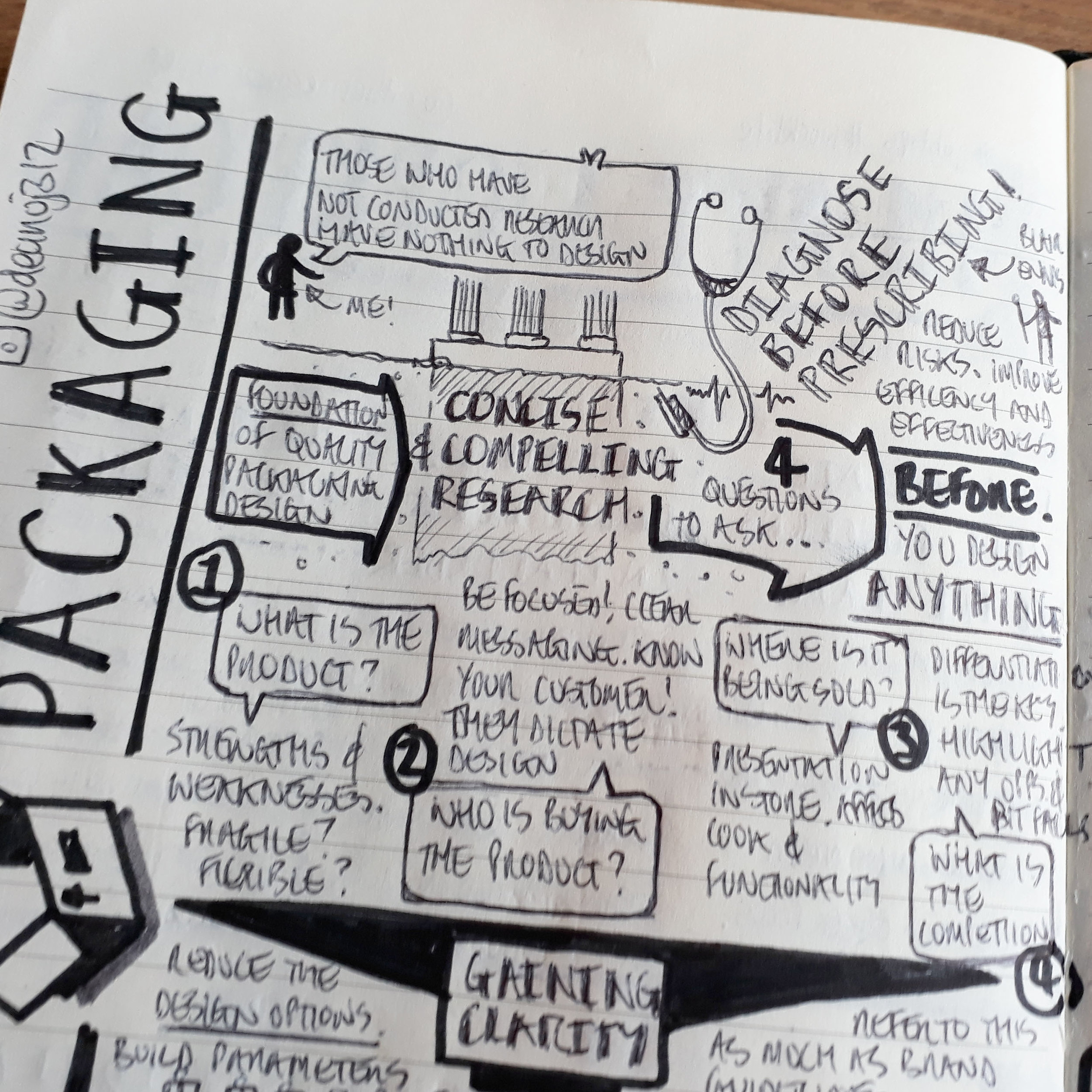
As the legendary creative business guru Blair Enns said “you need to diagnose the problem before prescribing a solution”.
So let's start at the beginning with research… don’t make that face.
We’re not talking about scrolling through a few Pinterest boards or looking at the latest posts on the Dieline website.
I mean concise and focused research that you usually see on those ‘who dunnit’ true crime documentaries we are all currently obsessed with.
Even the most stupid and basic questions, if directed correctly, can inspire, lead or inform the design way more than a month’s worth of Pinterest scrolling.
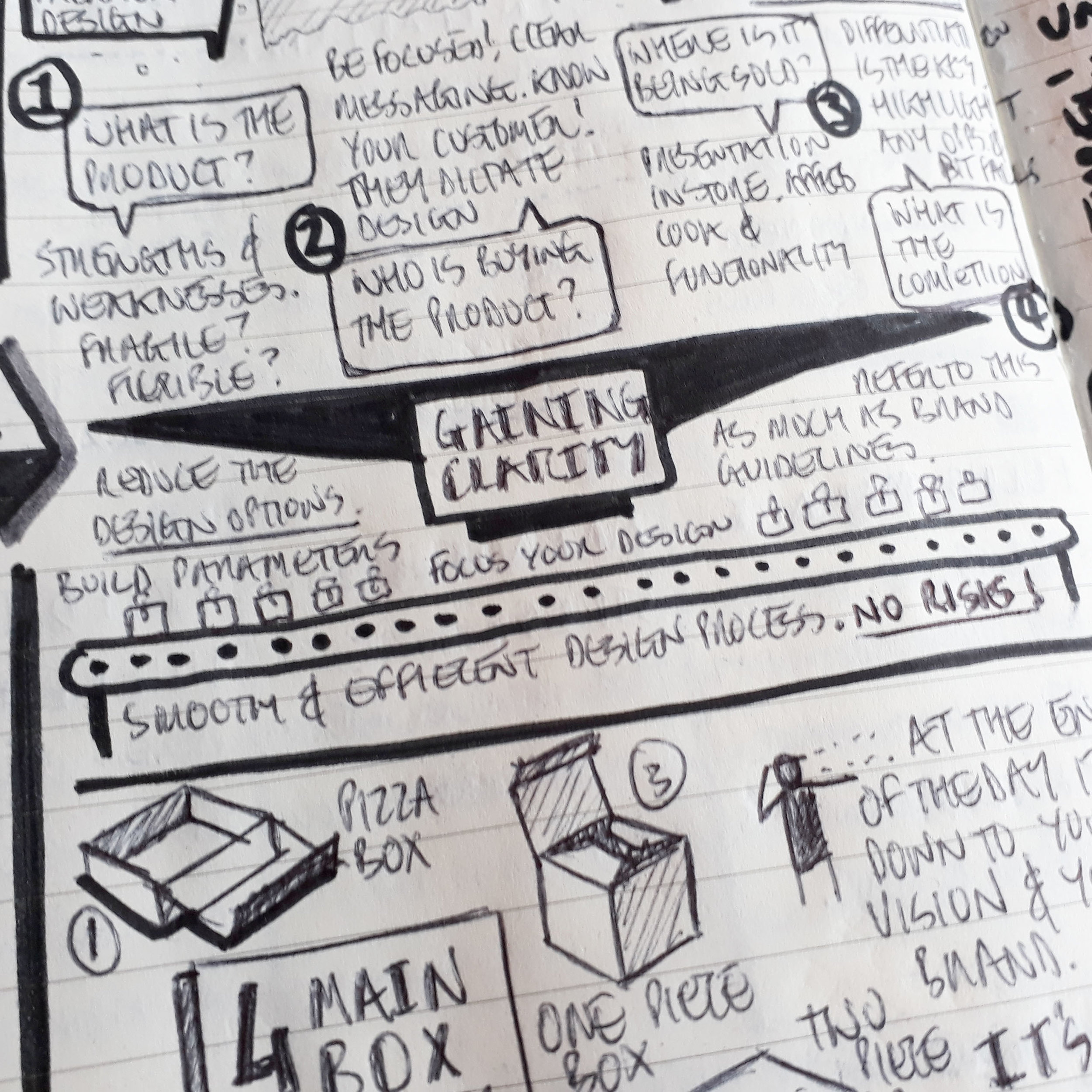
The aim is to start building creative parameters to help direct the design process towards the best possible solution.
What is the product?
Okay, this sounds like an obvious question, but it can be the most important one.
You need to understand as much detail about the physical qualities of the product as possible.
Is the product breakable?
Will it need more protection from bumps and knocks?
If your product has a particular finish, or smell, you may want to show show that off with a window or an opening?
Knowing this information helps to inform the physical attributes of your product’s packaging.
Who is the consumer?
A wise person once said ‘you cannot be all things to all people’... so don’t!
Packaging design works best when it is focused.
By conducting a careful analysis and getting to know your consumers and/or buyers, you can ensure that your design speaks to them in their language and on their terms, addressing their needs and desires clearly, in a way that resonates with them.
Where will it be sold?
Every store is different, considering display arrangements and lighting styles.
Knowing how your product will be displayed or even positioned in the store can add some unique design parameters.
For example, some stores display primarily through hanging products - knowing this before designing packaging can affect the structural design of your solution.
If all of the weight of your box is to one side of the box, it is going to hang in a lopsided way in-store.
We love the satisfaction of straightening up that wonky family photo hanging on the wall, but imagine if it could never be straightened out.
Could you live with that?
I know I couldn’t.
Who is the competition?
We all know that differentiation is one of the keys to a best-selling product.
However, too much difference can be deadly.
Understanding the commonalities in your competition is one of the best ways to understand your marketplace - how it should or should not be done - giving you valuable insights into opportunities, but even more important, a greater understand of category archetypes.
These are subconscious to the average consumer, but communicate key information about what the product is, simply through the silhouette of the package, colours used, or finishes.
For example, the use of kraft in packaging design has now become visual short-hand for hand-crafted, artisanal products.
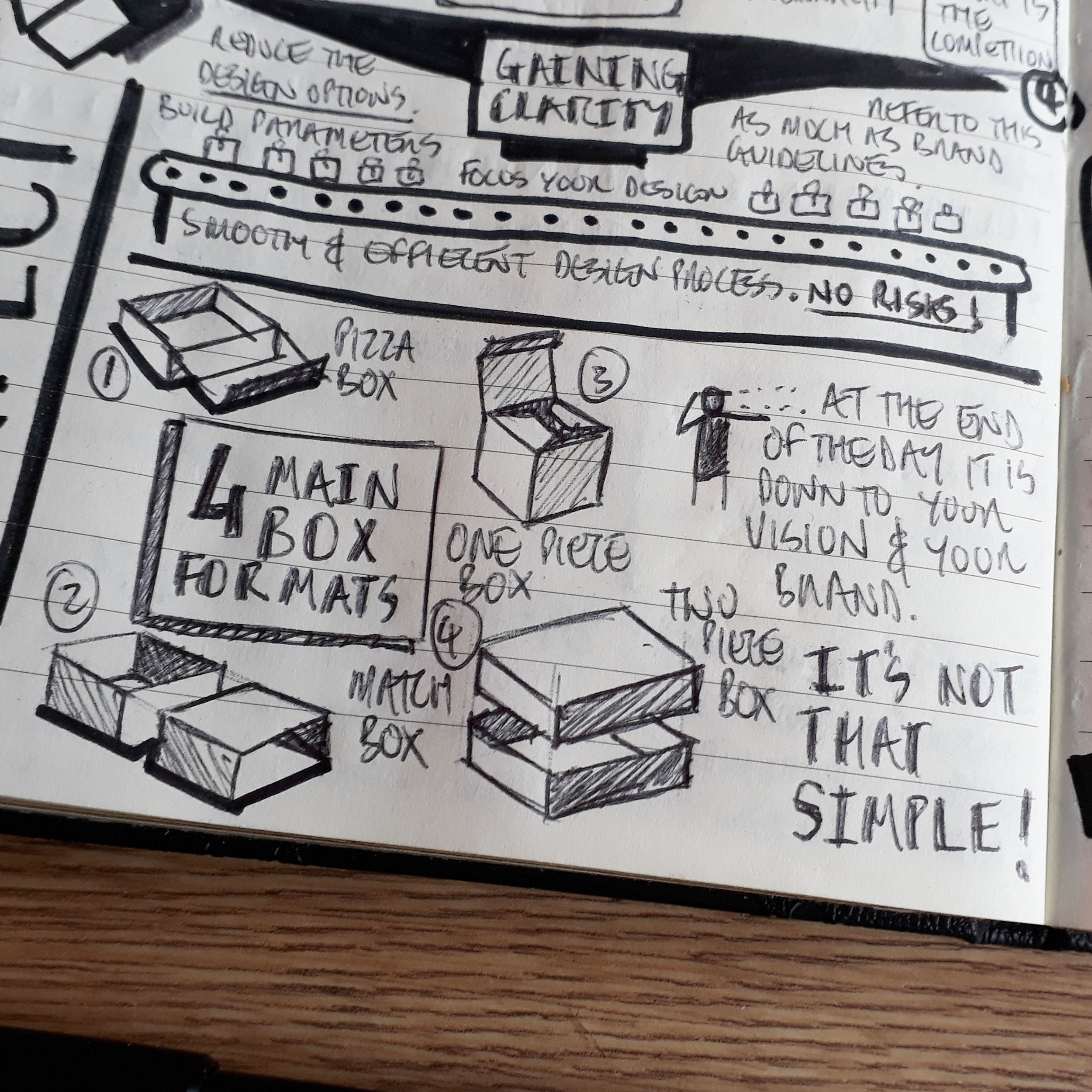
How should we pack it?
Finally, it is time to think about what format your packaging will take.
There are four main packaging formats: pizza box, match box, one-piece box and a two-piece box.
These are the foundations upon which all packaging designs are built upon.
Each one has its own physical limitation, due to the unique way that they each are assembled.
Don’t fret - with each limitation, there are opportunities to spark a little joy in your design.
For example, one-piece boxes have locking tabs, which are usually left blank, even though you are paying for it to be printed.
Why not use that space?
Add in some care instructions, brand promotions or social media links.
It’s these considerations that elevate your design from the others, adding value to that all important unboxing experience.
Once this research is completed, you should have some solid design parameters in place, alongside your product brand guidelines.
This directed research focuses your design efforts, having a dramatic effect on the efficiency of your design process, reducing the amount of time in the ‘prescription’, or design phase of the project.
It will also act as the lubricant to keep your design engine running smoothly.
Image courtesy of @cristoferl via Unsplash.
When it comes to the ‘prescribing’ or designing phase, it is all about reducing the ‘creative risk’.
This means reducing your amount of options down to what you now know will be the right fit for the design, the brand and your consumer.
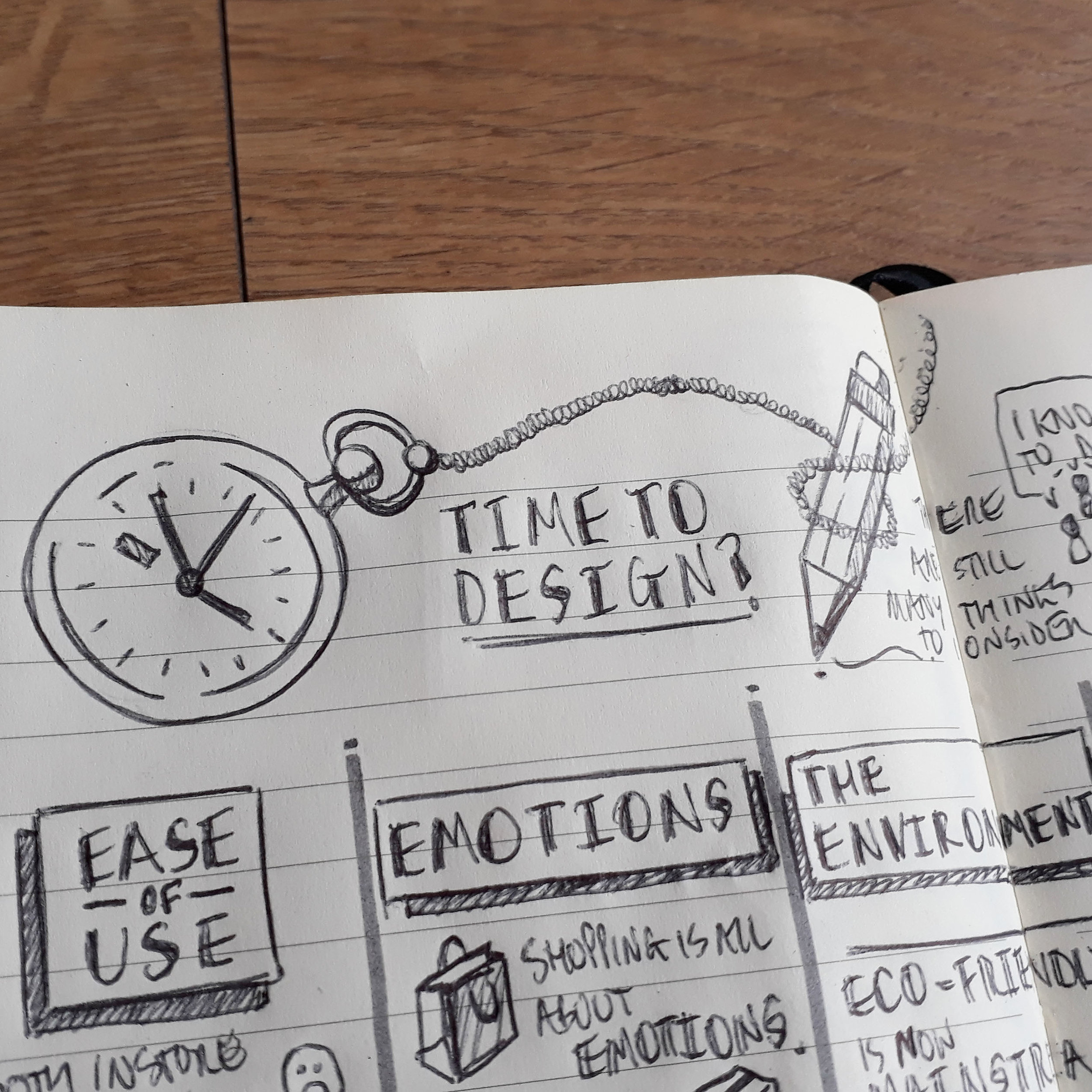
Time to start designing, right?
Not yet!
There are still many other areas to consider researching before committing to a design idea.
They may vary from project to project, but here are some of the big ones that I have found come up time and time again.
Materials
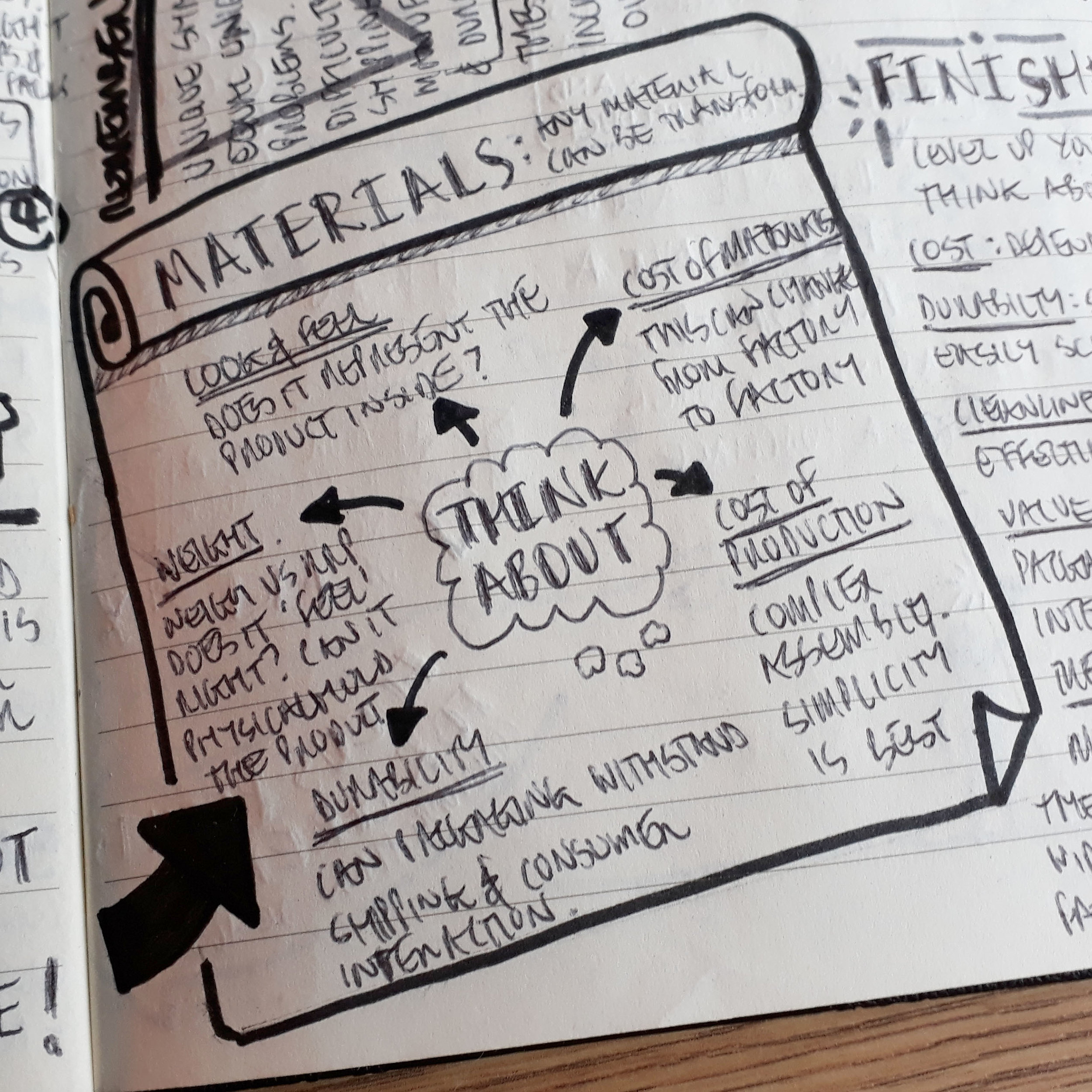
Your choice of materials can have a huge impact on both the look, but more importantly, the feel of your design.
We humans are kinesthetic creatures: we love to touch and play with anything we can (ooh-er).
Use this knowledge to push your design further.
The choice of material can have a subtle but fundamental effect on the perceived value of your package design, and can be used to hint to the qualities of your brand and the product inside.
The cost and availability can vary from factory to factory.
It’s always best to ask for samples of materials where possible, and ensure your factory is crystal clear on what you are trying to achieve.
There is a massive drive for more eco-friendly materials and processes, but supply is still catching up with demand.
Many of these new materials are only viable in small production runs, and are currently very specialist, but this will not be the case for very long, as factories in the far East and closer to home will begin to meet the growing consumer demand for more sustainable packaging.
Your final packaging needs to both function and look great across its entire life cycle, from packing and shipping to sitting on the shelf in store, and finally in the hands of your consumer.
Durability is one of the cornerstones of good packaging design.
Just think about how many times you’ve repurposed a nice piece of packaging for storing other items (shoutout to those using the KonMari method to organise your house).
One of the main factors to consider with durability is the physical weight of the product you are packaging.
You may need to test your product by conducting some drop tests.
Every packaging designer should be familiar with the mantra “to protect and inform”, and durability is the key to the first half of this.
Finishes
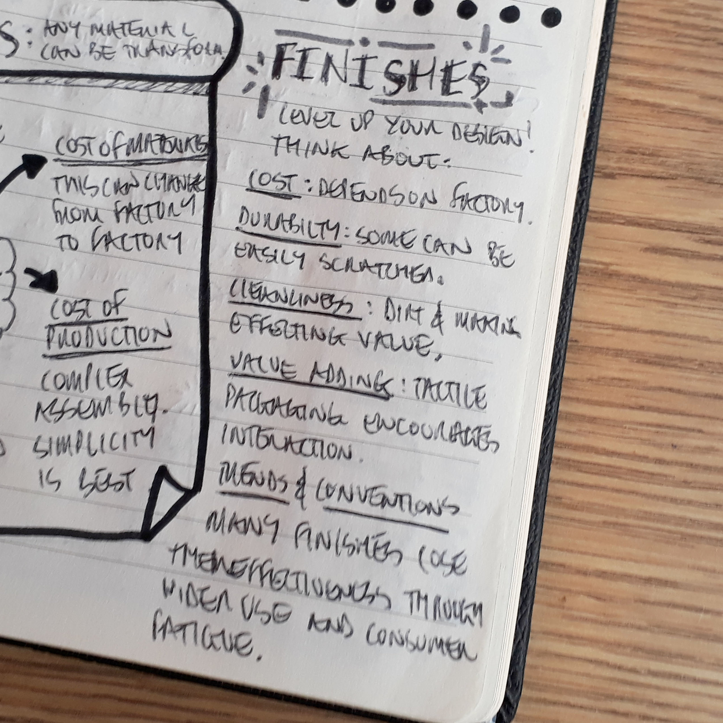
This goes hand-in-hand with your choice of materials: when they work together, it can lift your packaging design to whole other level.
The right finish can increase perceived (and actual) value, and help catch the eye of consumers, encouraging interactions.
As with materials, durability is one of the main considerations in choosing finishes.
Some finishes are notorious for damaging, marking easily or looking dirty quickly (looking at you velvet lam/soft-touch).
Communication is key - speak to your factory about the best options for your product category and retail environment, and request samples.
You need to know how it feels.
One last thing to consider with certain finishes is the conventions and trends within popular culture.
Many finishes are used in packaging design as part of a ‘current’ trend, but these can lose their effectiveness through overuse, becoming ‘normal’ to the average consumer.
In addition, the time it takes to respond to a current trend to create packaging can mean that the trend has died by the time the product hits the shelf.
Be mindful of the trends in your product category, and in adjacent categories, to stay ahead of the game.
Shape
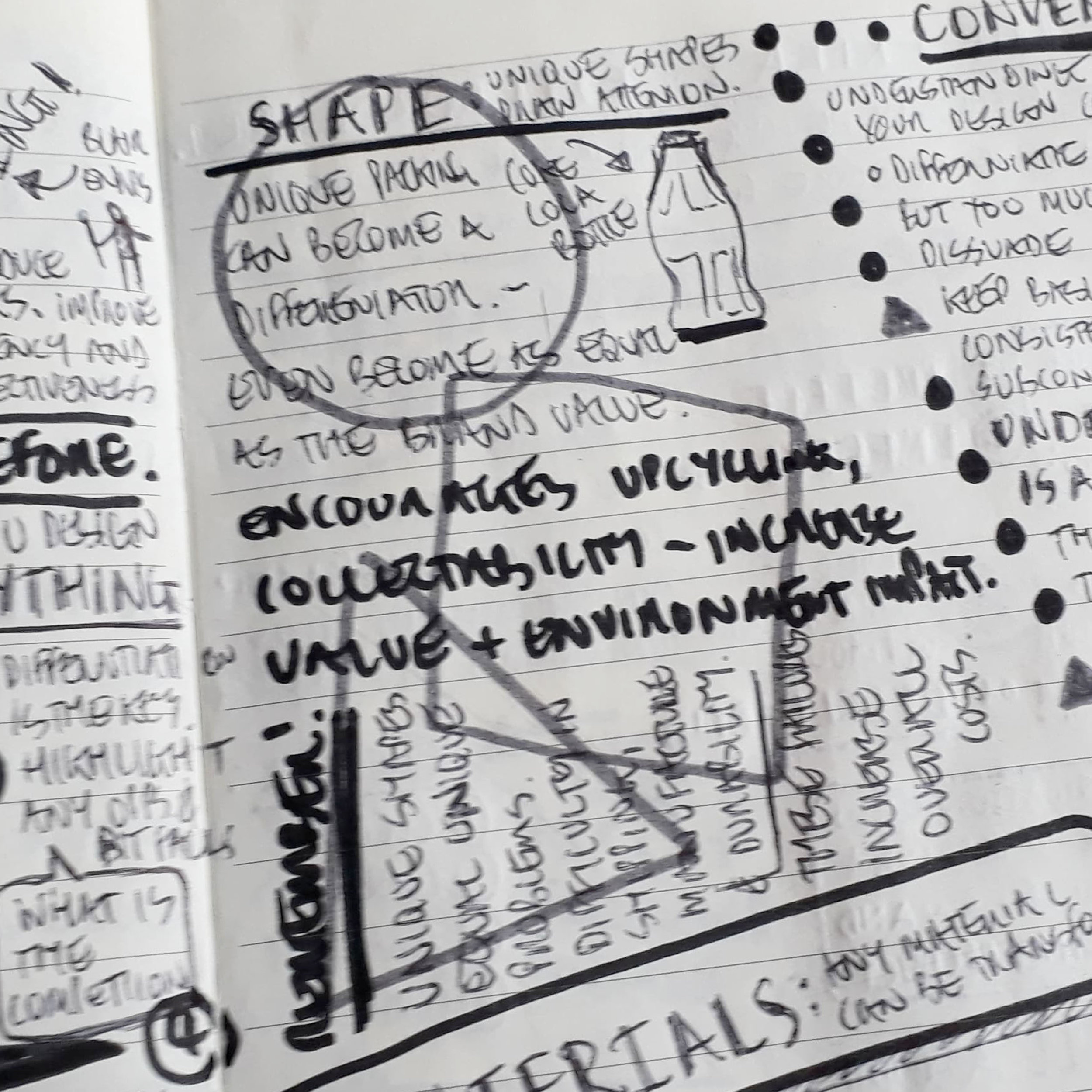
This is one of the easiest ways to catch the eye of the consumer and draw them in. If done correctly, it can even become as iconic to your brand as the product itself.
Think about the Coca-Cola bottle - these are now collectors items!
A unique packaging shape, however, comes with unique problems.
Unusual shapes can cause a massive headache for your factory: complex assembly, extra shipping support to prevent damages, weak structure points in the design.
If your design is not structurally sound, the failure rate can be high increase your overall costs.
You have been warned.
Conventions
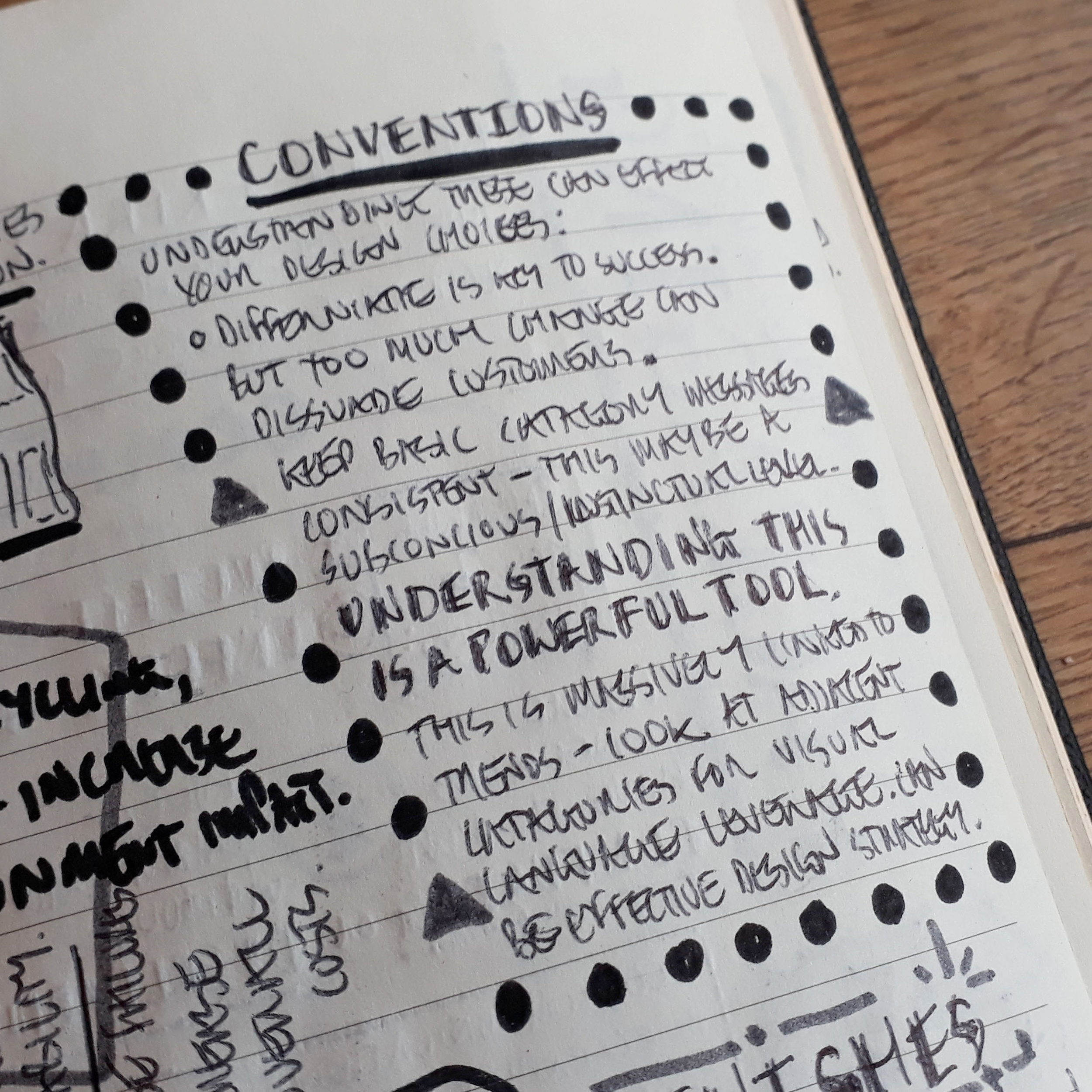
This is an overlooked aspect of prescriptive phase.
Understanding the long-standing conventions within your product category can build some of the biggest design parameters to focus your design.
Too much difference, however, and you run the risk of alienating your product from potential consumers.
We all know that differentiation is fundamental to the success of your product, as mentioned earlier.
There are usually reasons for traditional conventions, even ones that seem like ‘bad design’.
Conventions come in all forms, many of which we have already spoken about: shape, materials, finish, colour, even tone of voice.
It’s important to understand the established conventions to determine where the boundaries can be pushed for the betterment of your design.
Of course, you have to maintain certain category conventions to meet consumer expectations - you wouldn’t go looking for a box if you were after some crisps, you’d be looking for a foil packet on the shelf.
Consumers often make buying decisions on a subconscious level: “I like this one. Why? Because I do”.
Understanding conventions and how to leverage them can be a powerful tool when it comes to the design phase.
Conventions are partly linked to consumer trends, and many are connected to new techniques becoming affordable to manufacturers.
An example of this is the increased use of gold foiling on packaging.
This technique was once reserved for high-end products, portraying a more luxury look and feel.
The over-saturation of this technique has now devalued the impact to consumers - it doesn’t feel like luxury when it’s everywhere.
The design purist in me wants to say, that the best way to stay ahead of trends is to avoid them.
However, this is not always possible, so my advice is to stay ahead by studying brands adjacent or similar to your category that target the same consumers.
You can absorb their visual language cues into your own design solution.
Image courtesy of @rawpixel via Unsplash.
After all this, you must remember not to be afraid to be different.
As branding guru David Brier says, “difference equates quantifiable value”.
For new brands and products with little or no consumer recognition, you are going to need to create something spectacular to grab consumers’ attention.
All of these research areas will build unique design parameters and will ensure that you will stand out from the crowd with an awesome packaging design solution.
Time to start designing, right?
Not quite yet - just one more thing.
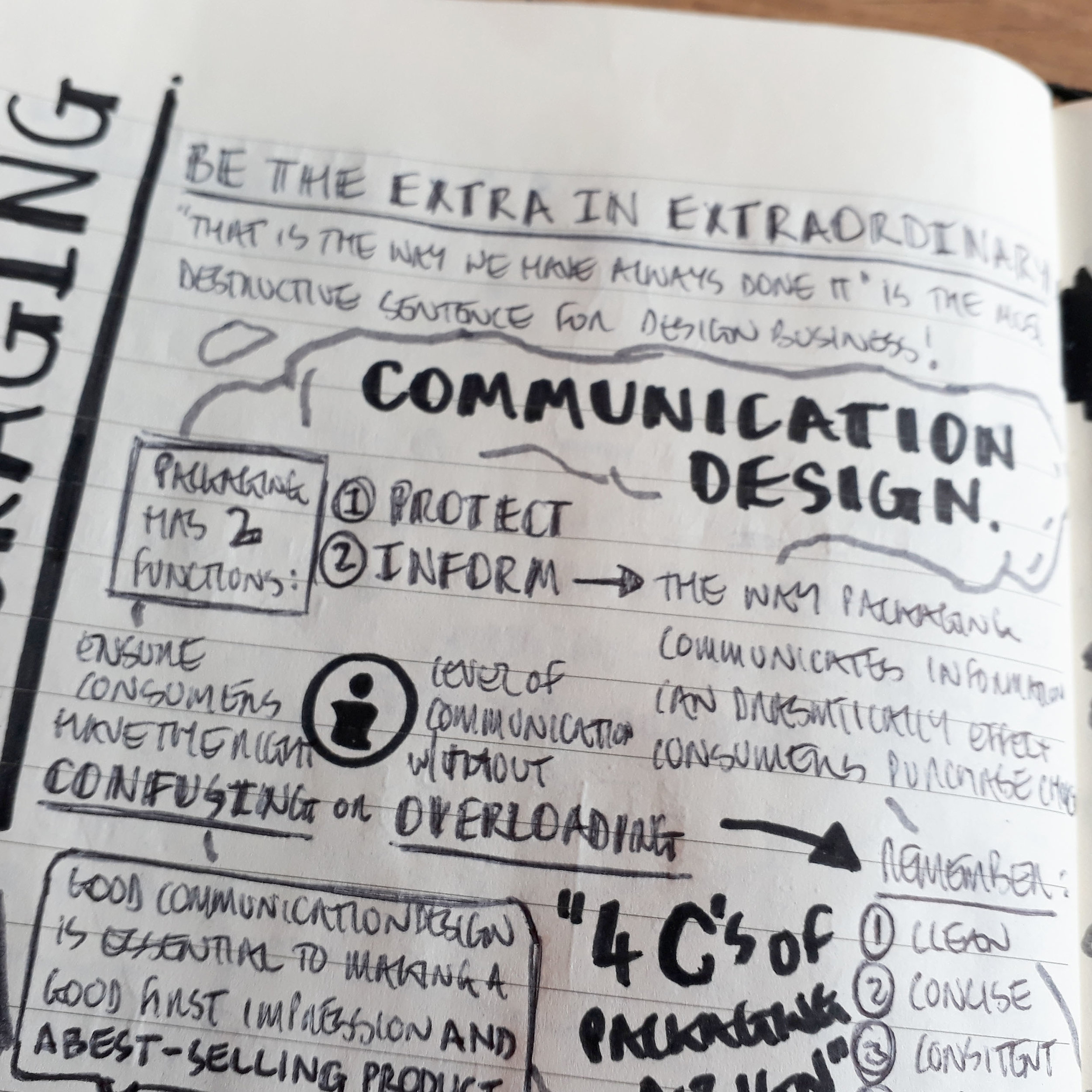
Earlier, I mentioned the packaging designer mantra “to protect and inform”.
Now, it is time to talk about the second and arguably the most important part: inform.
This is the art of communication design.
For packaging, this is the way that the visual aspects of the packaging communicate to potential consumers about the product inside the packaging.
It can have a big impact on a consumer’s buying decision.
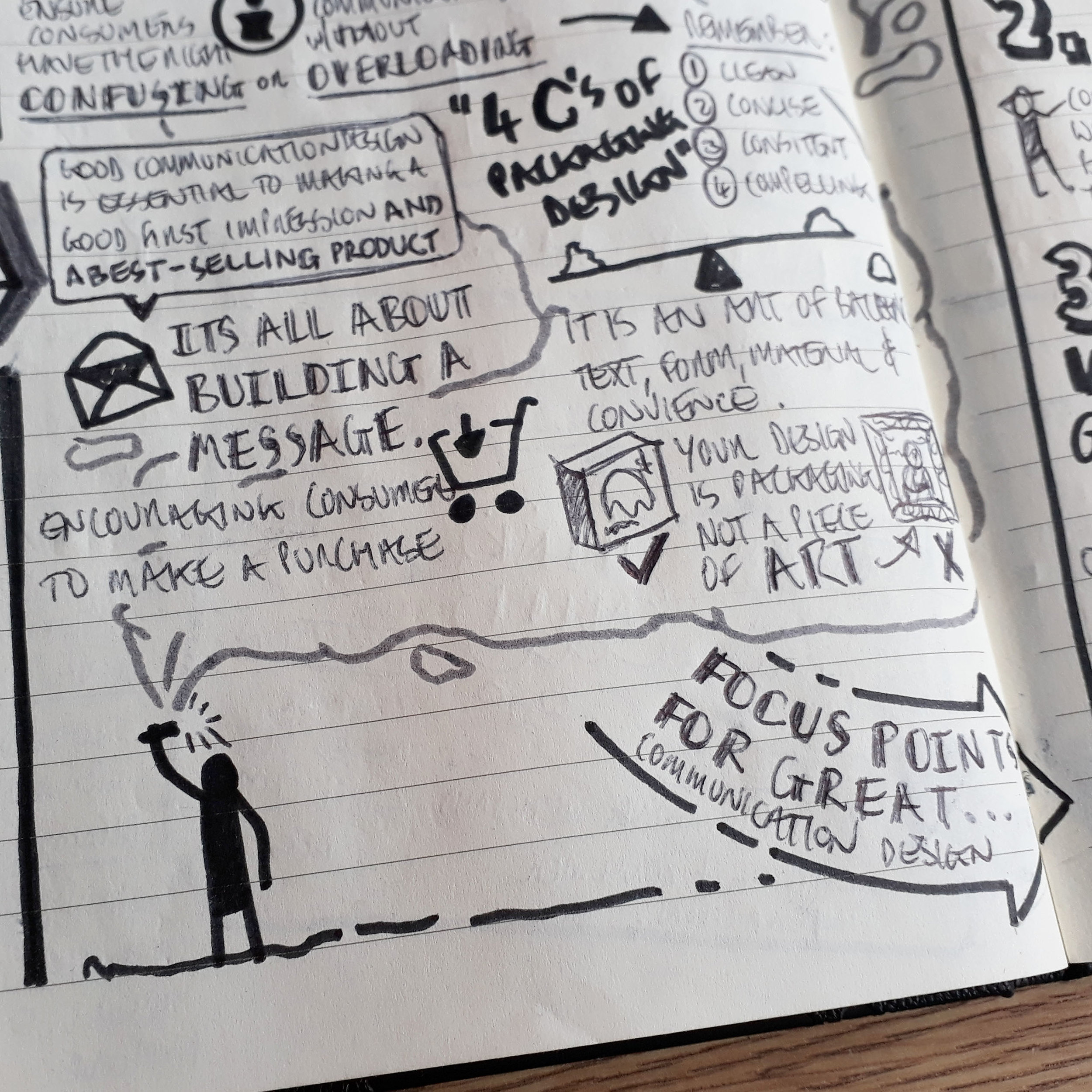
The art of communication design for packaging lies in your ability to present the perfect balance of information the consumer needs to make a decision to buy, without confusing or overloading consumers with all of the information you want, or need, to communicate, whilst considering brand representation, all the legal and safety jargon required by various laws and legislations.
The goal is to create an informative piece of packaging design, not a piece of graphic art.
My best advice to great communication design is to follow the four C’s: clean, compelling consistent and concise.
I’m not sure where I picked this up from, but it has guided me through countless projects.
Make sure that you have the four C’s in mind every time you are working on a design.
Image courtesy of @impatrickt via Unsplash.
We all know the quote “the harder I work, the luckier I get”, but I prefer “the smarter I work, the luckier I get”.
So here are some tips and techniques for keeping your communication design on point:
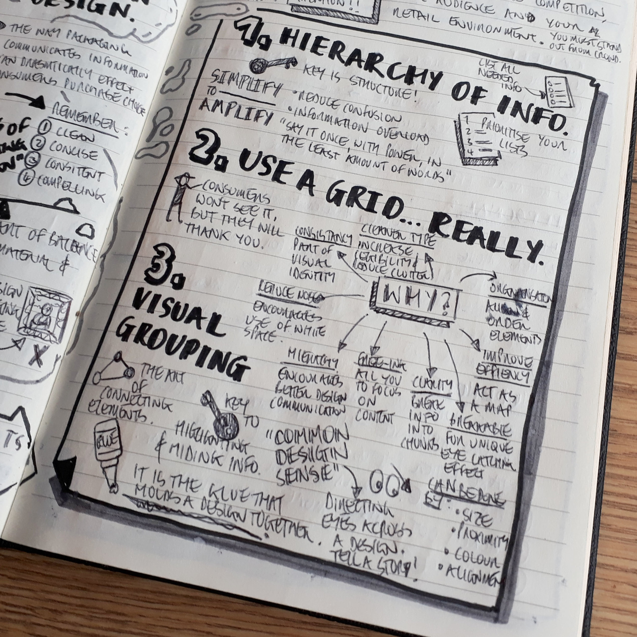
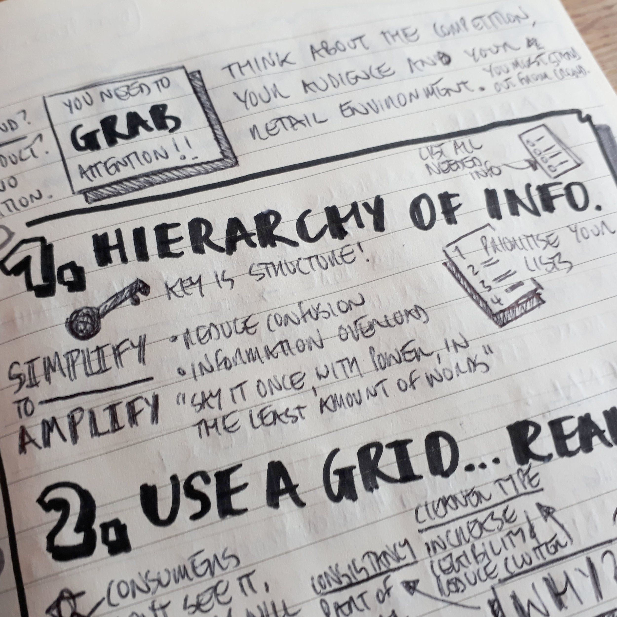
Hierarchy of Information
Creating a clean piece of communication design means structuring the information in a way to that is easy and convenient for the consumer to take in, ordering it by how important it is.
This will reduce confusion and information overload.
To create a clear hierarchy of information, it is best to gather a list of all the information needed to be included on your packaging, then rank them from most to least important.
During the design process, this allows you to prioritise them, so you can focus your design on the elements that truly matter to your potential consumers.
Say it once, say it with power, say it in the least amount of words.
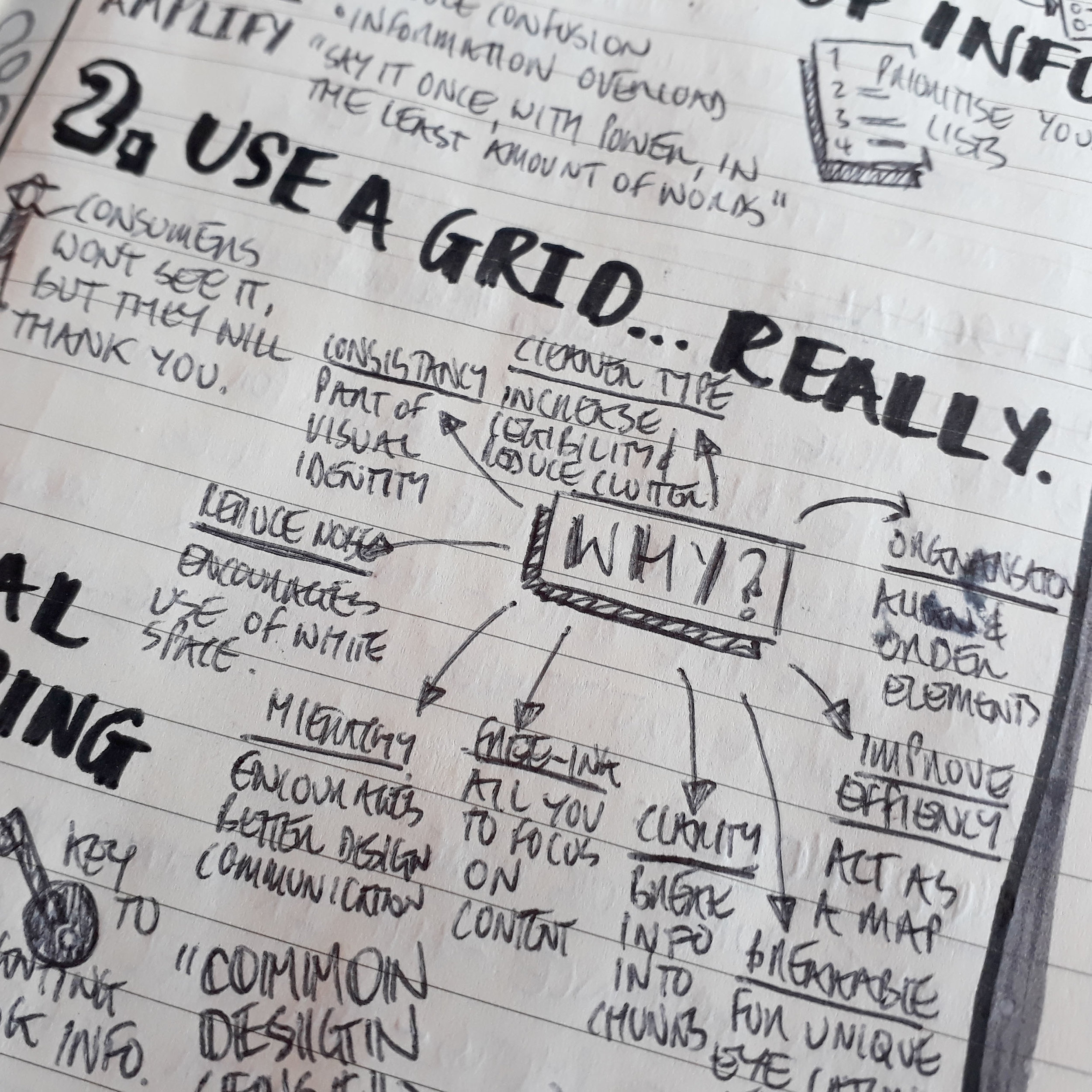
Use a Grid!
To some, this may be obvious, but in the heat of the project, it can be easily forgotten. It is an extremely powerful tool to ensure a consistent and clean piece of communication design.
Your consumer won’t see the grid, but they will subconsciously be thankful that you used it.
Here’s why you should always use a grid (where possible):
It organises your design, aligning and ordering your design elements into an eye-pleasing piece of packaging design for your consumers.
Grids act as a design map, helping to position and place the various elements of your design.
In combination with your hierarchy lists from the previous section, this should help you to be super-efficient at creating your design, freeing up more project time to work on the important stuff like the content and design elements themselves.
Aligning your typography to a grid increases the legibility and reduces ‘design clutter’ in your design, again making it easier for the consumer to read.
If you are designing multiple products in a range or brand, across many box formats, grids have the power to become part of your visual identity.
Creating consistency across multiple designs helps to create a cohesive design language across your project.
As we all know, white space is fundamental in design, and grids encourage the use of white space, allowing your content to breathe.
Legibility is key for great communication design.
The universal design language of grids allows several people to work on a product range, giving the team a ‘design guide’.
This reduces miscommunication and undue stress during the design phase of the project.
Grids allow you to easily manage your hierarchy when designing, so you can arrange design elements to be the most effective they can be.
Clear use of grids breaks up information in a logical way, making it easier of consumers to digest.
Grids are a guide, and from time to time, grids can broken to create a unique eye-catching effect.
But over do it, and your design will just look messy.
Some of you out there may be saying “using a grid limits my design freedom!”.
Now you know that’s crap.
Grids will liberate your design time, so you can focus on the content of the design rather than how you are going to squeeze all the information you need into your packaging design.
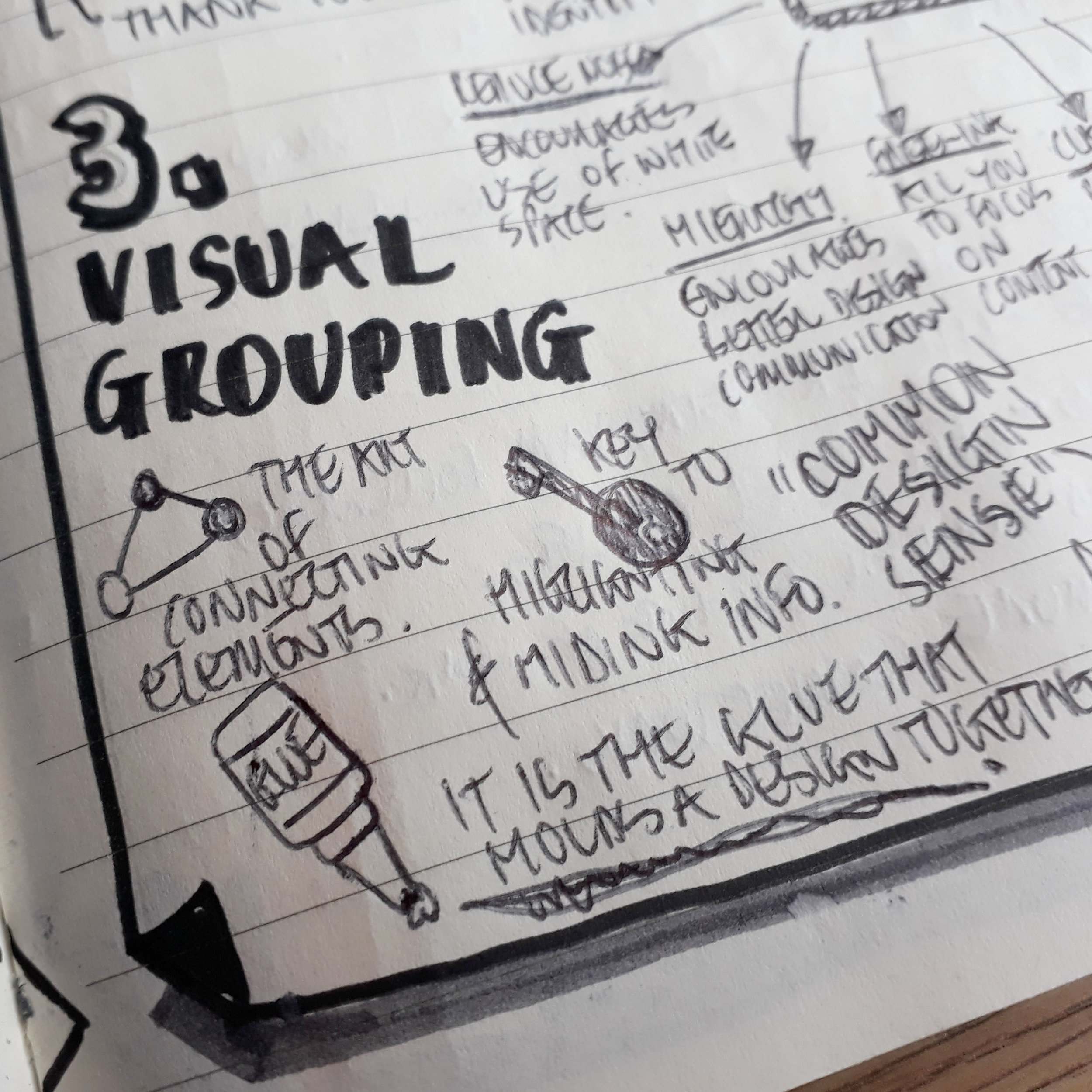
Visual grouping
Visual grouping is the glue that holds your design together, connecting your disparate elements across a piece of packaging.
It can also be the key to highlighting important information and hiding those boring or ugly elements.
Many of us, as designers, already do this subconsciously, since it is an effective tool for directing the consumers’ collective eye across your package, improving consumer interaction.
There are many ways to visually link elements together, such as size, proximity, colour, or grid alignment.
Visual grouping allows you to build a story across your packaging design, creating a compelling piece of packaging design.
Image courtesy of @giggiulena via Unsplash.
Surely now it is time to start designing, right?
Yep, everything is now in place, you have all your research, and the design parameters they have put in place, and brand guidelines.
It's now time to put pen to paper, or rather, hands to a computer.
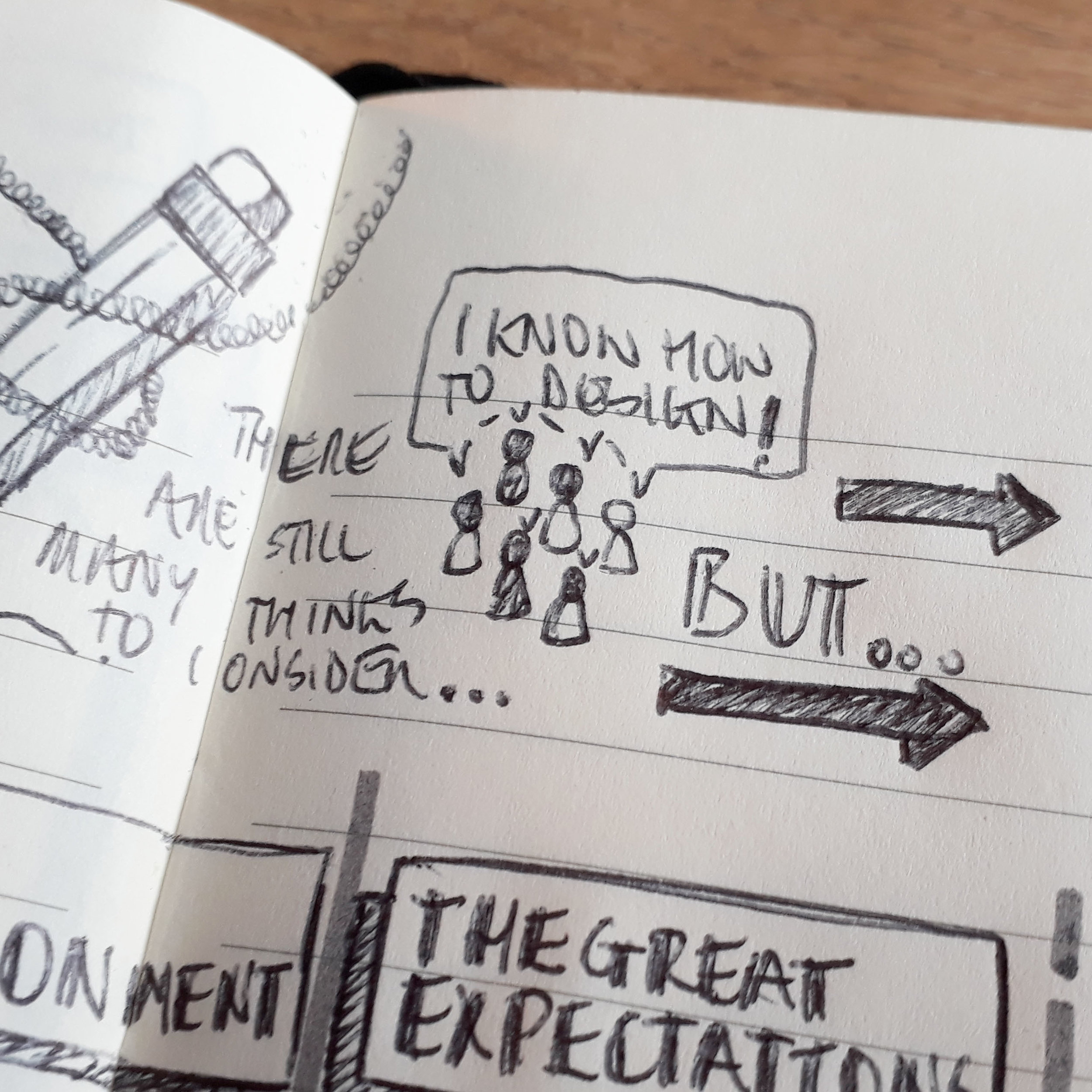
We all know how to design, so I am not going to hold your hand through that.
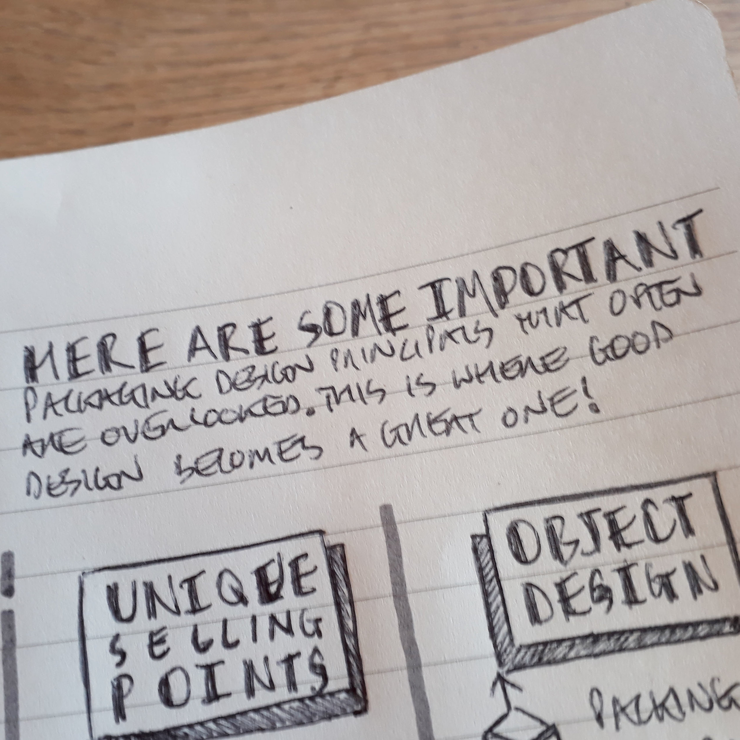
The following section outlines some important design principles that I have noticed often get overlooked.
They can often turn a good design into a great one!
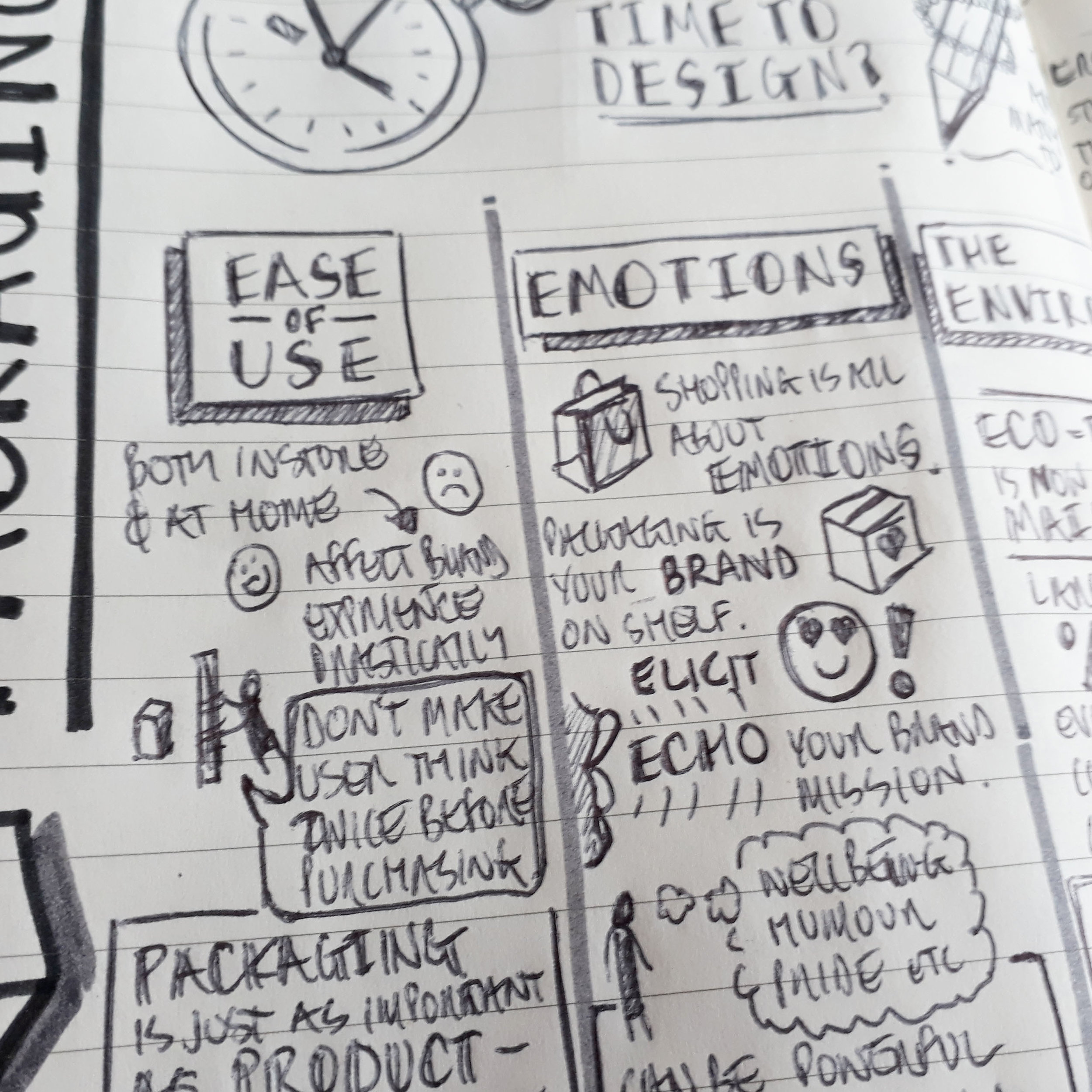
Ease of Use
Think back to all those times you struggled to open packaging.
Did it leave you in a good mood?
Not likely.
How easily your consumers find your packaging to interact with in-store, and at home, can drastically affect their overall experience of the packaging and the brand it represents.
There’s so much choice in today's market that a packaging design that is difficult to open or use can cause the consumer to think twice before making a purchase or repeat purchase and they could consider your competitors over you.
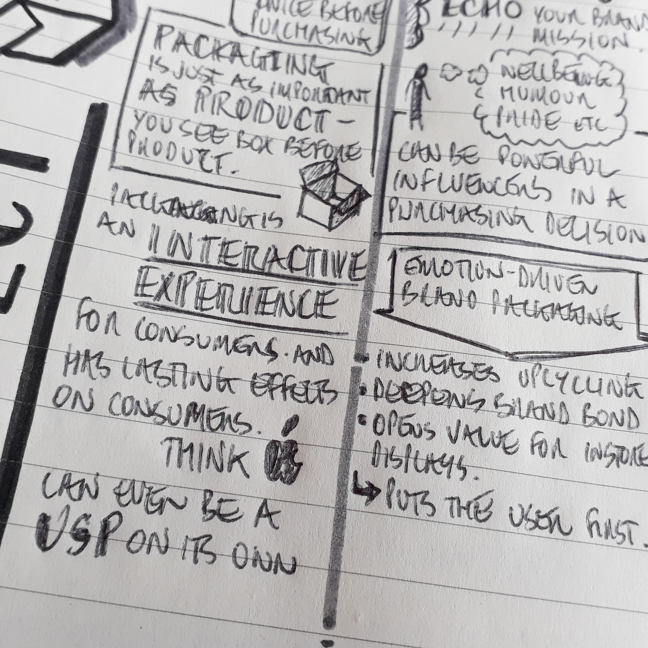
Packaging design is often led by graphic design and manufacturability, but by focusing on the interactive experience, packaging can have a lasting effect on consumers and even become part of your brand’s unique selling point (USP).
Think about the hundreds of hours of videos with people unboxing products on Youtube.
Can you afford to ignore this aspect of packaging design to promote your brand and product?
Shopping is all about emotion
Packaging design is a totem for your brand when it sits on the shelf in-store.
It is the physical embodiment of your brand, so it must echo your brands mission, drawing in your audience.
Using consumer feelings of well-being, confidence, pride, humour and joy can be a powerful influence to justify a reason to buy.
The consumer who connects with your brand though your packaging increases the chances of them upcycling your packaging, deepening their connection and becoming a brand ambassador.
Think about the shopping bags and boxes you have kept and reused in your own house.
This emotional draw your packaging and brand can have in-store can be a major deciding factor with how your product could be displayed.
Brands and packaging with a higher emotional draw are often given prime locations in shops, increasing the chances of drawing in consumer, and ultimately, the chance of purchase.
Environmental impact
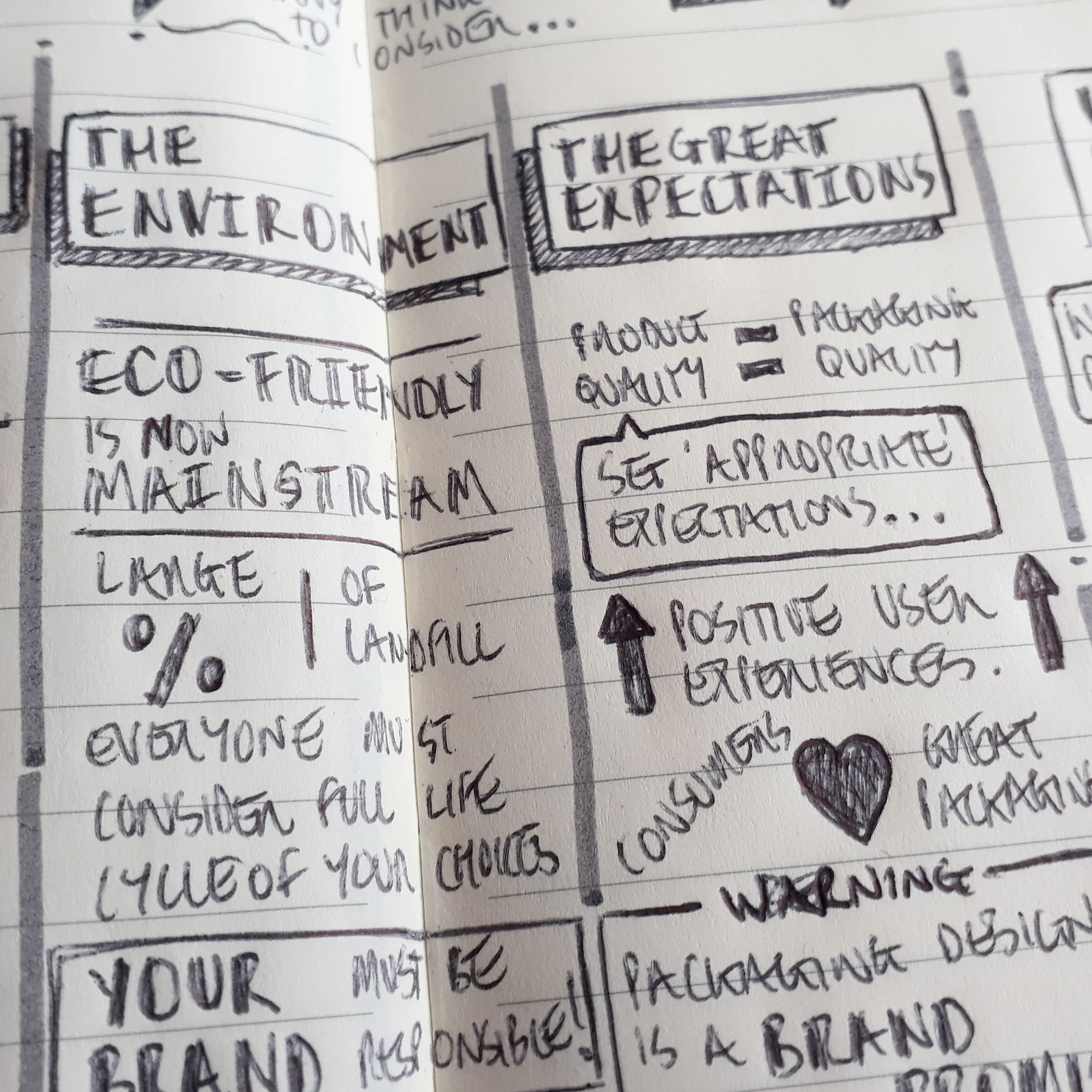
Here’s the sobering fact: packaging makes up a huge percentage of landfill waste.
Eco-awareness and sustainable living is only going to grow across all markets.
It’s extremely important that it becomes part of your packaging design process.
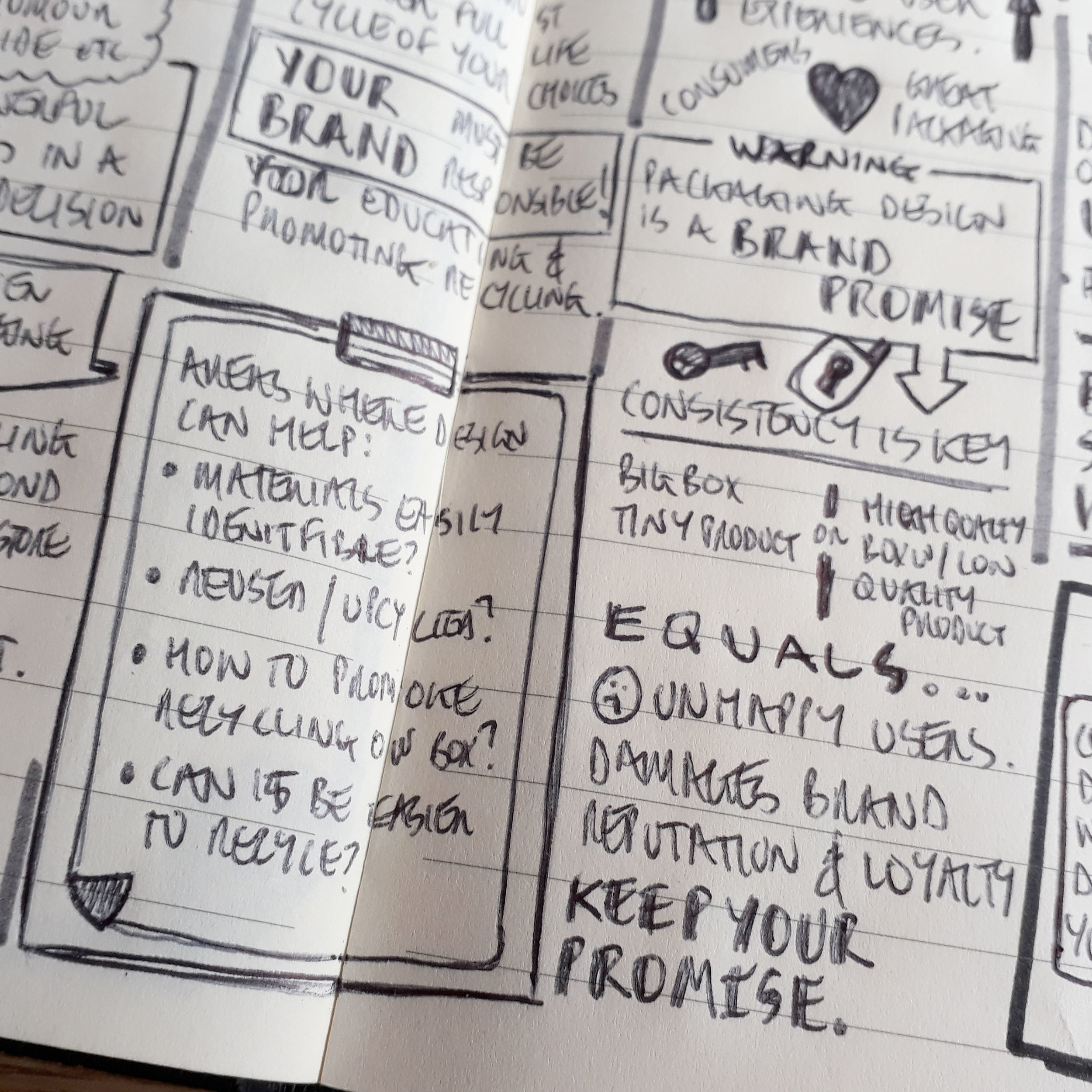
It’s your responsibility on behalf of your brand to educate your and promote the benefits of recycling.
There are many ways that the environment can impact on the choices you make when designing a piece of packaging.
Here are some questions you should be asking yourself:
Are the materials used easily identifiable, to help the consumer separate for recycling?
Can your packaging be reused/upcycled? Can it have a dual use or be upcycled?
Is recycling promoted on the packaging?
Does it have easily identifiable prompts and symbols for the consumers?
Are the materials and finishes easily recyclable and eco-friendly during production?
Managing Expectations
Everyone loves exciting packaging design.
It gets consumers fired up about the brand and the product inside.
No matter where your product sits in the quality scale, you must ensure that the packaging sets the appropriate expectation for the product.
The look and feel of a piece of packaging design is the pinky promise between your brand and the expectation of the product inside.
A consistent message is the key.
We have all experienced the disappointment of getting a piece of packaging with a tiny product inside.
This is a broken brand promise.
It leaves you feeling dissatisfied and disappointed, with a bad experience of the brand.
This kind of dishonesty damages a brand's reputation and loyalty.
Without your brand reputation, you will lose your audience.
Consumers are smarter than ever, and are becoming more aware of these kind of tricks.
Now using social media, a single bad consumer experience can be shared with millions of potential consumers.
Remember, consumers are more likely to leave a negative review than a positive one.
Be brand-aware, and keep your pinky promises!
Communicating Unique Selling Points
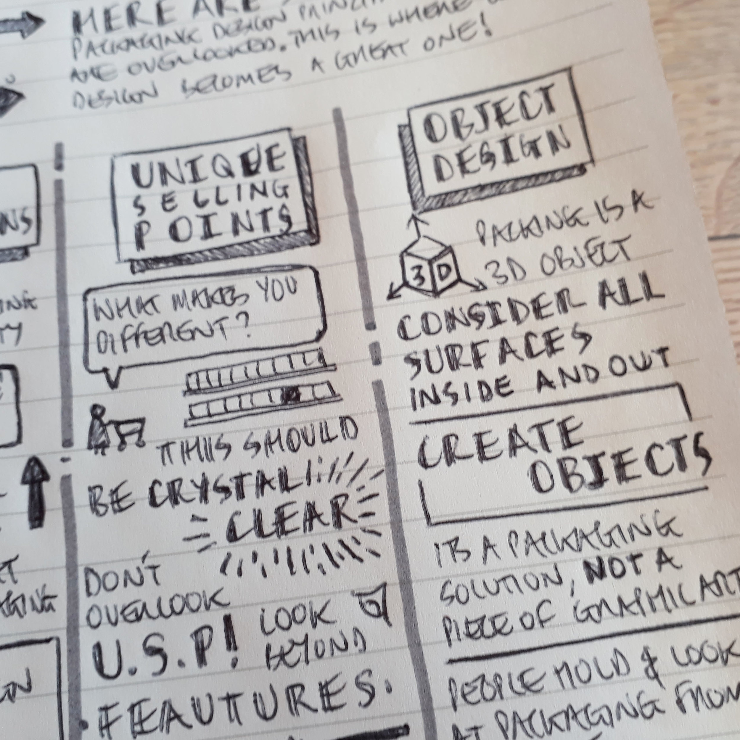
Your unique selling point (USP) is the statement about what differentiates your product from all the other options. It is imperative that your USPs are communicated clearly in your packaging design.
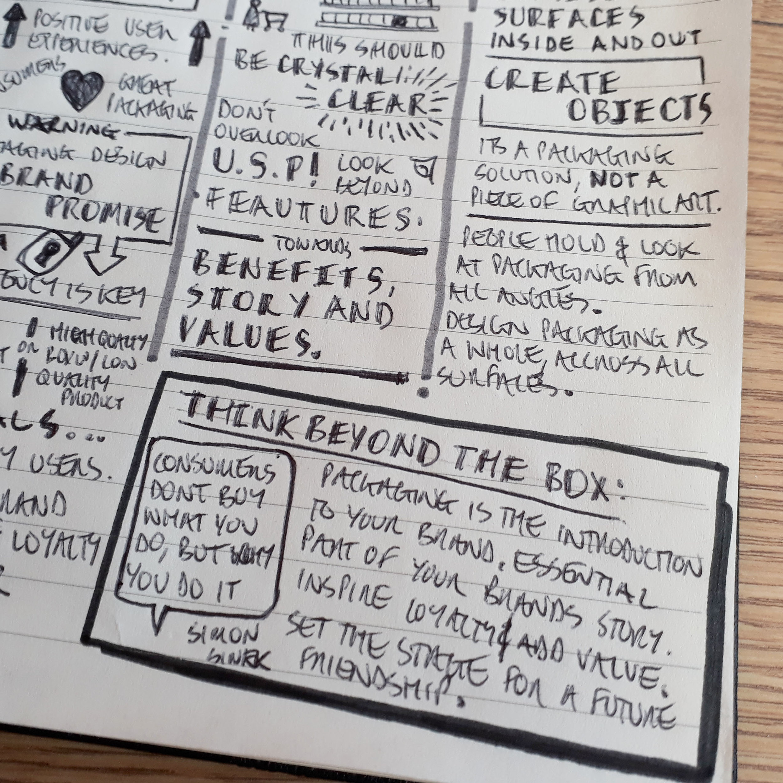
We could write a whole blog post on crafting USP (stay tuned), but, in short, you need to look beyond the features of your product, since features are easily replicated by other brands.
Instead, build your USP around your brand story and values.
These emotional hooks will draw in consumers that resonate with your brands messaging.
We are in a new era of consumerism - no one cares about the features anymore, people are seeking connections to brands and products that align with their individual beliefs and ideas.
Ensure that your product’s USP reflects this.
Packaging is a 3D object
It sounds obvious, but remember that packaging is a three-dimensional object.
When you are designing on a computer screen, it is easy to forget.
You need to consider the design of all printable surfaces, inside and outside to create a seamless object.
As we mentioned before, we are designing packaging solutions, not a piece of graphic art.
Every surface of your packaging should work together as one, promoting both the brand and product. Don’t fall into the trap of design packaging surface-by-surface.
Design all the surfaces at the same time. Make regular mock-ups to prove that the design is fit for purpose.
Consumers will inspect packaging from all angles, hold it in their hands, so your packaging needs to hold up under this intense scrutiny.
Designing in this holistic way allows you to work around production tolerances, like print alignment, improve speed of development from concept to production-ready artwork, and reduce the risk of development issues further down the road.
That’s everything for Packaging Design 101!
I hope this helps you create better packaging solutions that leap off the shelf and into your consumers’ lives.
As a mini graduation present, below I have created a link to a high resolution PDF of my nudenotes research I made in preparation for writing this blog.
If you have any questions, leave them down in the comments, and I will answer as many of them as I can.
I’m planning to create and share more packaging design content like this in the future, so stay tuned.
I just wanted to say a massive thank you to all my sources of inspiration: Chris Do and the whole team at The Futur, David Brier, Blair Enns, Fabian Geyrhalter and Douglas Davis, just to name a few.
Not forgetting every source from my research-trawling of the internet.
I’ll leave you with one more thing to consider…
Image courtesy of @ryoji__iwata via Unsplash.
Think beyond the packaging.
Packaging is the introduction to your brand, it is that all-important first impression, inspiring loyalty and building quantifiable value for your consumers.
Packaging design sets the tone for a future friendship to grow and flourish.

