14 Ways to Enhance Your UX
Image courtesy of @oneshotespresso via Unsplash.
The term ‘user experience’ (UX) can be mind-bogglingly broad, and can potentially cover every single interaction with your brand that your customer experiences.
However, in a more specific sense, it’s often referred to when talking about customers’ technical experiences -- whether they’re on your website, mobile app, using your online service, or even searching for you online.
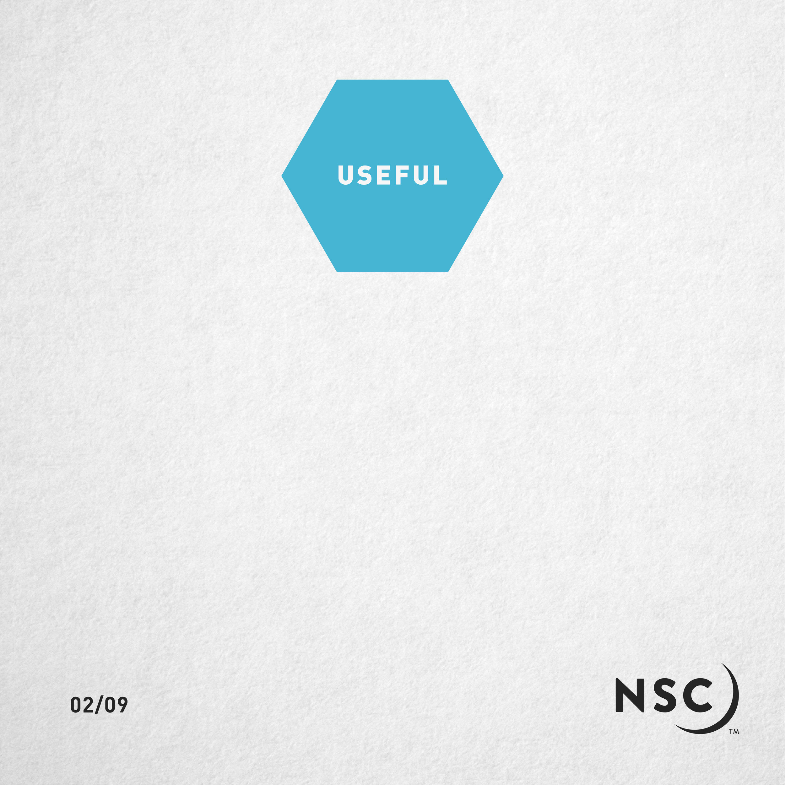
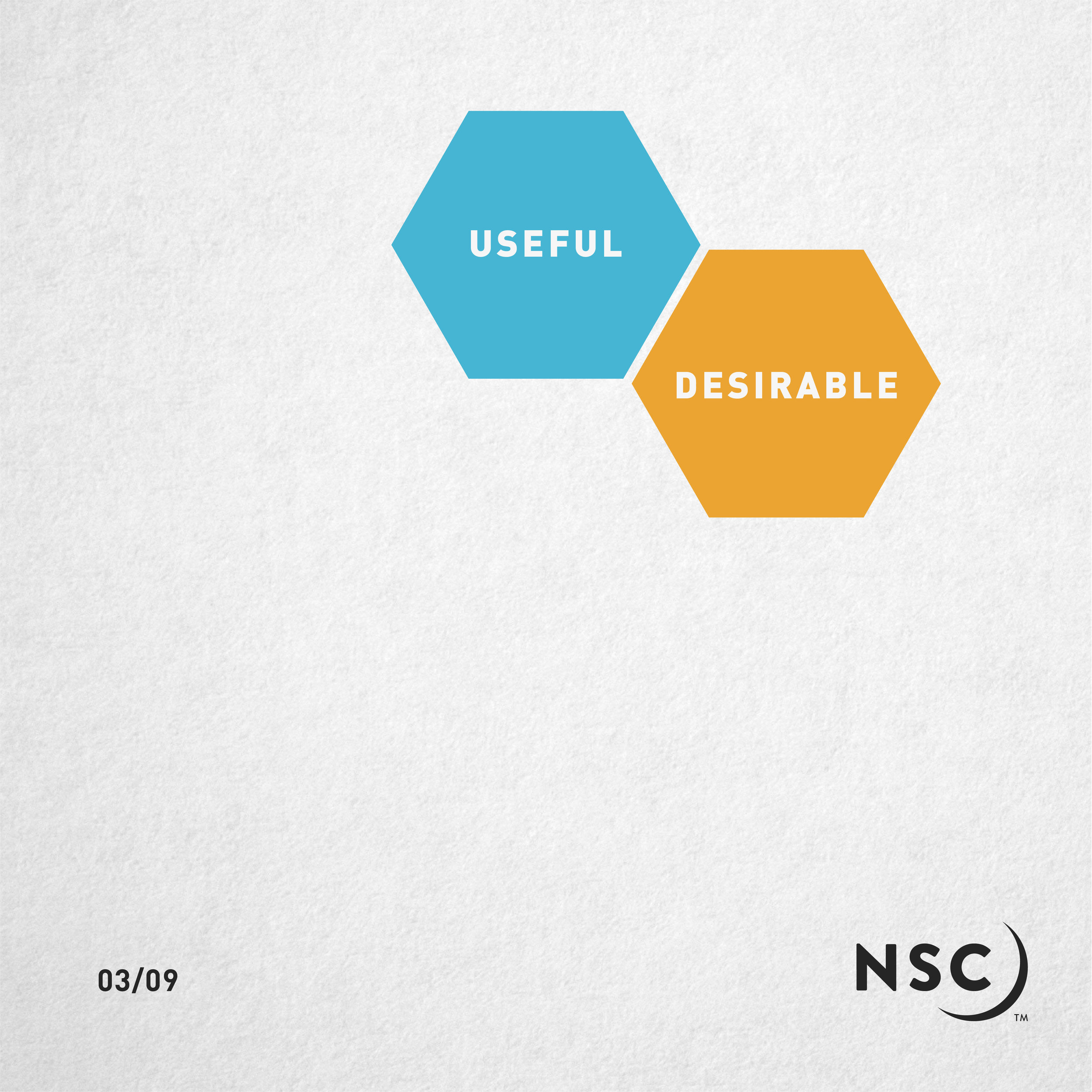
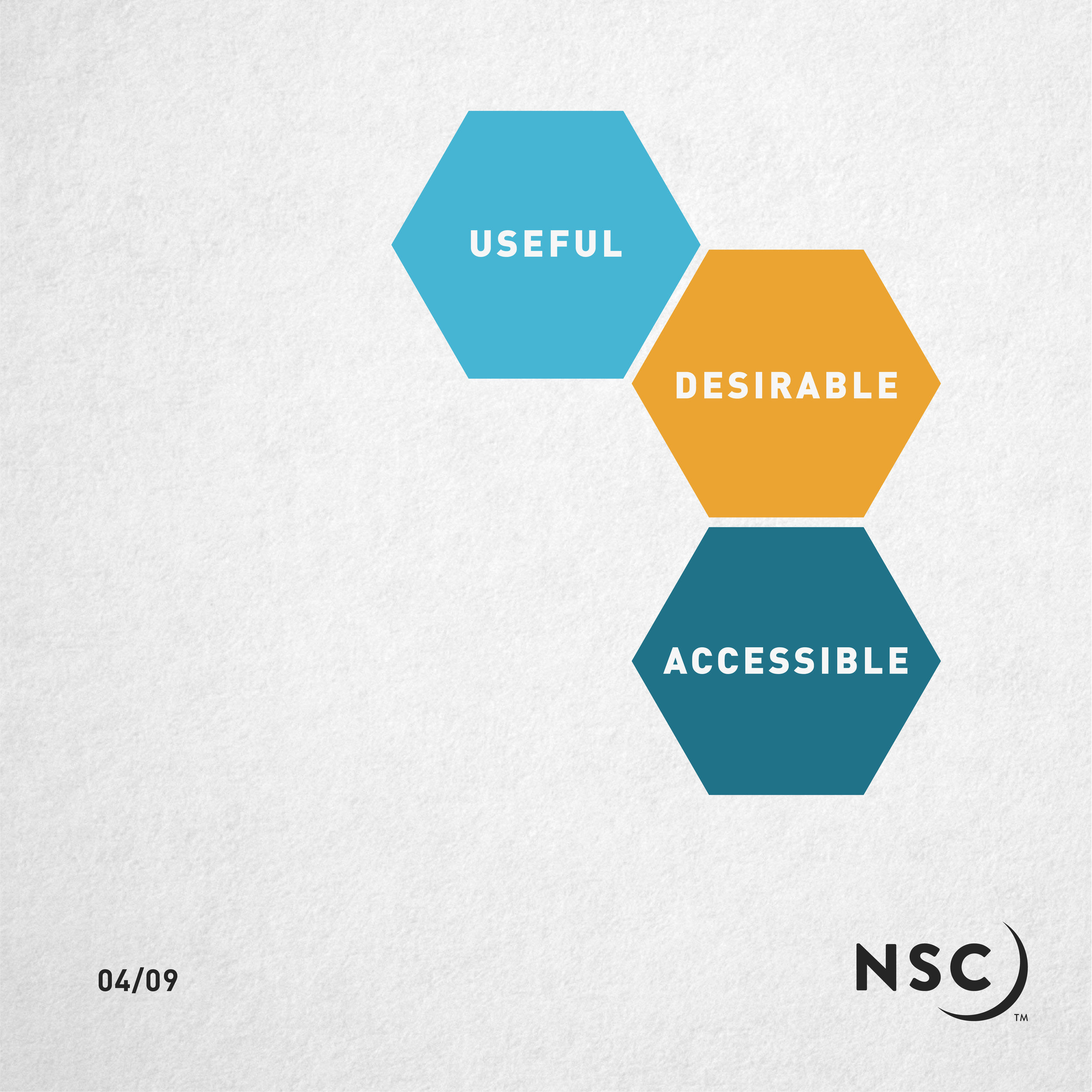
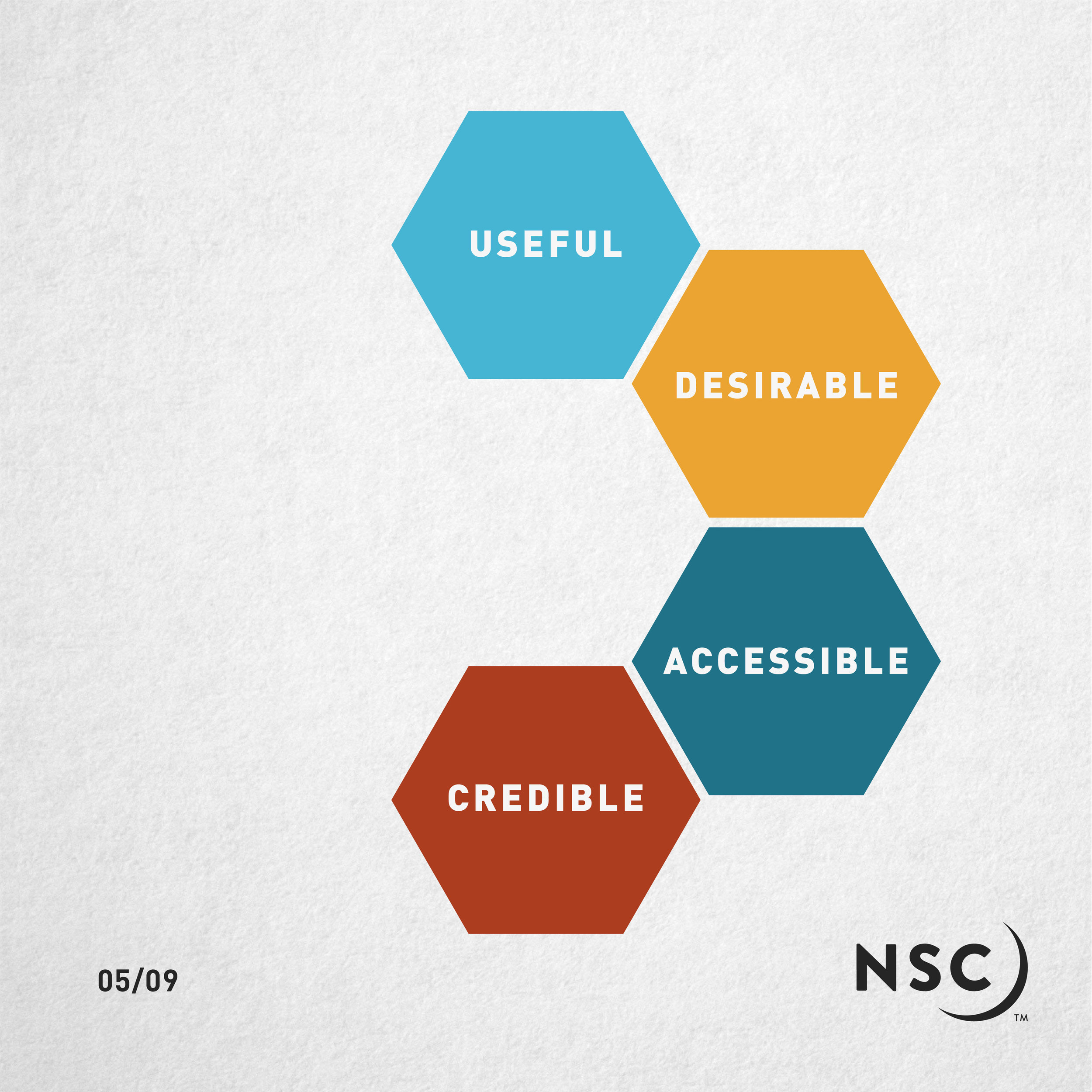
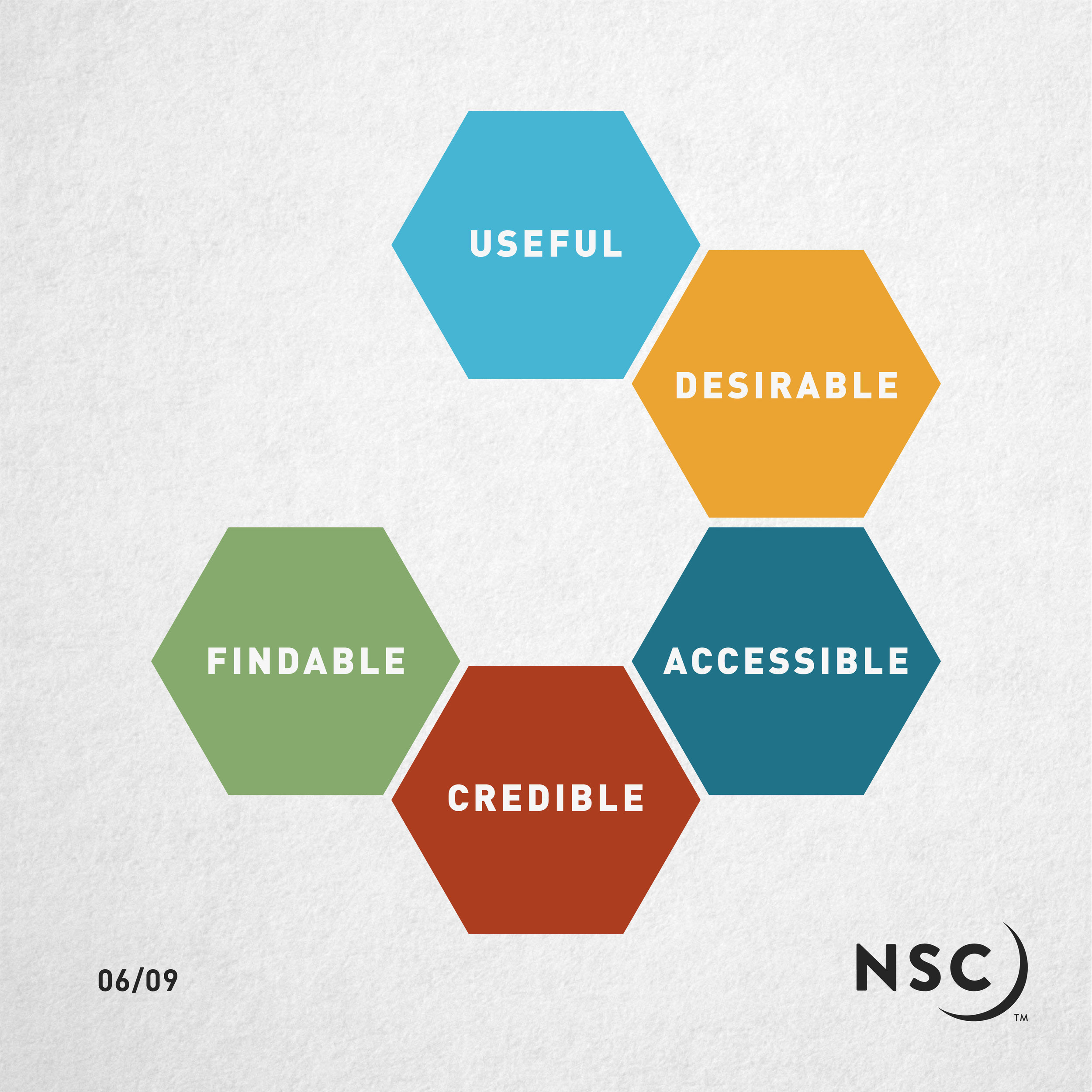
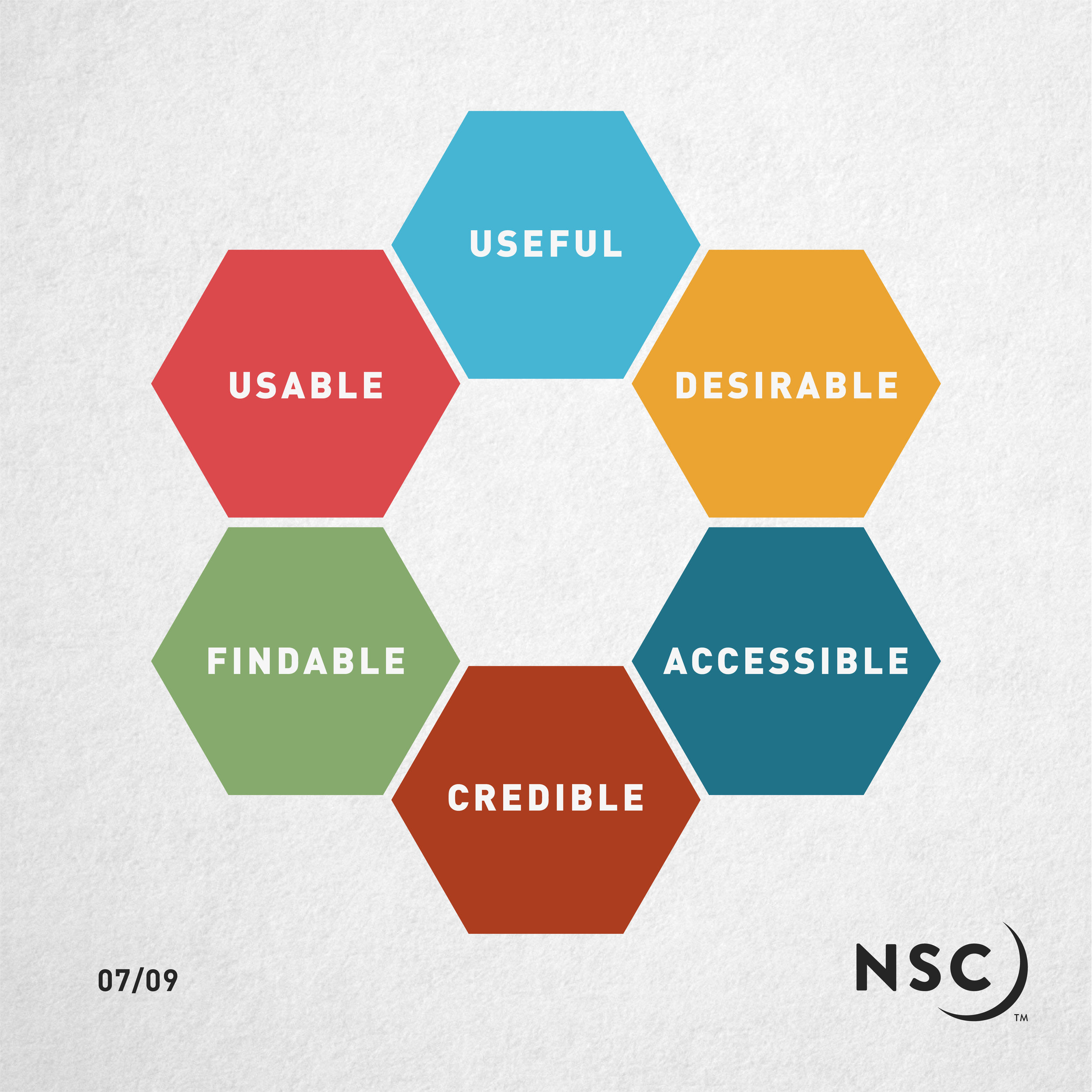
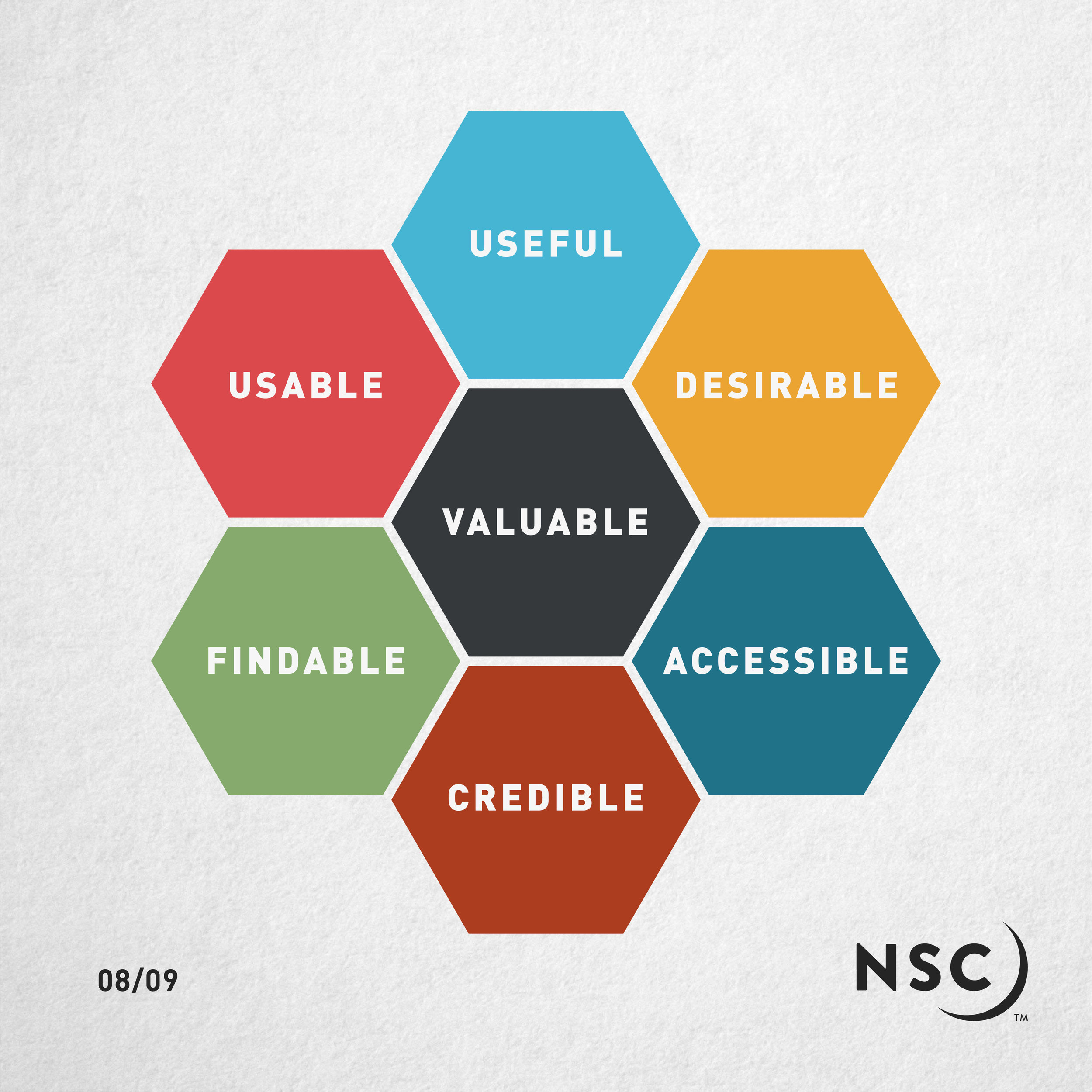
According to Peter Morville’s UX Honeycomb, good UX has to be:
Ultimately, good UX comes down to empathy.
You have to put yourself in your customers’ shoes.
Getting started
The best way to get started is to pinpoint who your audience is.
Creating customer personas is a particularly useful exercise for this.
If you’re not sure what customer personas are, they’re sort of a CV or resumé for a fictional person -- your ideal customer.
As your business could have lots of different types of customers, you should have corresponding customer personas.
For example, when Lucozade were first starting up, it was seen as a medicinal drink, so their audience was, exclusively, those who were ill.
Quite a niche audience.
However, according to marketing legend, those children’s mothers would take sips of Lucozade in the afternoons when their energy levels began to slump.
And so, Lucozade’s audience was widened.
So how do you get started with creating your customer personas?
We’ve actually created a handy template to help you get started, and get your empathetic cogs whirring.
Once you know more about your audience, then you can work towards improving your UX to best suit them and their different needs.
There are lots of ways that you can improve your UX. Here are a 14 actionable tips and tricks you can use to enhance your UX:
For each of your customer personas, map a customer journey, with split paths where you think they might drop off or go in a different direction. This customer journey will then help you to pinpoint where people might be vanishing, and see what you can do to stop that from happening.
Try A/B testing, where you try out two versions of something on your website (or email, mobile app, etc.) and track which version works best, by using analytics to see which works better for your customers. We’ve written an article to help you test different parts of your marketing, so check it out: Experimental Marketing: Try Something New.
Make sure that your website is running as smoothly as it can. If your website takes a long time to load up, that slow running could make visitors disappear quickly (or, as it’s referred to online, your ‘bounce rate’). In fact, according to a study by Akamai in 2008, 33% of online shoppers would wait just four seconds before bouncing off of a slow-loading website. With the advance in technology in ten years, that time has been cut down further -- in fact, Maile Ohye, whose CV includes giants like Google and LinkedIn, said that “Two seconds in the threshold for e-commerce website acceptability. At Google, we aim for under half a second.” Half a second. If you’re keen to cut down your loading time, here are a few things that could work:
Lower the resolution of your images (change them from hi-res to lo-res), so they take less time to load. You can also change your image files from .png to .jpg.
Try not to have a massive image as your website background image, it’ll definitely add to your loading speed.
Consider your website provider (like Squarespace, Wordpress, etc.). Often the cheaper, less well-known ones can cause slower loading times.
Cut down on the amount of plug-ins you’re using, particularly if you’re with Wordpress. If they’re not necessary, get rid of them.
Keep track of your loading speed with this tool, PageSpeed Insights by Google, and make a few small changes to see if they make a difference.
Consider your mobile users, and make sure that your website is optimised for mobile use. It’s about scaling your website down, and making sure that every button is easy to click with a finger or thumb. We all know how frustrating it is to have to zoom in to simply click a button on a mobile phone. Plus, according to a study in 2018, 52.2% of all website traffic around the world was generated through mobile phones.
Consider those in your audience with health conditions that may impact their experience on your site, and work to make it easier for them to engage with your brand. That being said, it’s near-impossible to completely prepare your website for people with every health condition, but engage your empathy to implement different ways of presenting your information to make it as easy as possible for everyone. For example, using alt-text on images (usually done when uploading images to a website) can help users with visual impairments.
Make sure that each page on your website is easy to navigate. Don’t just leave them stranded on a random page with no guide on how to proceed. It can be helpful to create a site map of your customers’ journeys on your website, which we cover in more detail in our article The Cyberspace Marketplace: Building Your Business Website.
Keep track of what your customers are doing on your website, app, or in emails, and keep tweaking your processes and content to better suit what they’re actually doing. You can also ask customers to provide this information, but, chances are, it’ll be less accurate.
Provide value on your website -- give them a reason to visit, otherwise they either won’t visit, or they’ll visit and bounce off straight away with a negative view of your brand.
Put more focus into the onboarding of your customer. That’s when you’ve got them on the hook, they’re on your website, but they might be starting to wriggle on the line. You need to keep them on that hook while you reel them in, and guide them all the way. To do this, you can use emails (if they’ve provided their email address), chatbots, or pop-up banners.
Make sure you have a clear place where people can contact you and/or ask questions. There’s not much worse than being on someone’s site, getting lost or wanting to ask a question about their product or service, then having to actively search for what seems like an age (but is actually five minutes) to find the information you need.
Keep calls-to-action clear. If you bombard a user with too many actions for them to take -- “Buy Now”, “Download the Brochure”, “Sign Up to Our Newsletter” -- they likely won’t do any of them. You need to make it as clear as possible which step they need to take next in their journey on your website.
Don’t underestimate the importance of FAQs. If you have the same questions asked by your customers, or you anticipate them asking certain questions, then create an FAQ page, to save them the hassle of contacting you to get those questions answered.
Make sure your website it easy to read, and don’t use bright colour text on bright colour backgrounds, or even black text on bright colour backgrounds. Try it -- it’s much harder to read, and really strains your eyes.
Make it as easy as possible for customers to purchase your product, and look at how competitors do it well -- like Amazon, who save card details and delivery addresses for a quick checkout.
Good UX comes down to understanding and empathising with your customers.
Imagine your website as a shop.
You wouldn’t want to make things difficult for the shopper by blocking their entrance, making prices difficult to read, not accepting debit cards, or by not labelling your aisles.
Consider who is visiting your website, what they want to achieve, and make it as easy as possible for them to achieve that.
Know your audience, and step into their shoes.


