Creative Cringe: Designer Edition
Image courtesy of @alicegrace via Unsplash.
There are many times in a designer's career when you will hear and see things the make you cringe.
I’m sure you probably come into contact with them every day – some of them you may not even notice them anymore, and others might make your blood boil every time.
In this article, I break down six cringe-inducing things that drive me crazy as a Designer.
But, of course, here at NSC, we’re all about the positive vibes.
So I’ll also share some handy tips on how you can navigate them, to keep your design sanity intact in the future.
Before we dive in, let's discuss what I mean by ‘cringe’ the dictionary definition is:
“bend one's head and body in fear or apprehension or in a servile manner.”
For me, the "bend in my head" is the shudder I feel when I see or hear a design 'faux-pax' in day-to-day life. Those little things that make you grind your teeth, twitch or pull that awkward I-don't-really-agree-with-you smile™.
It always makes me think of one of my favourite comedy shows, Blackadder.
In the fourth season, the main character, Captain Blackadder (played by the legendary comedian and actor, Rowan Atkinson), torments another soldier, Captain Darling (played by another acting legend Tim McInnerny).
Captain Blackadder repeatedly calls his fellow soldier "Darling" throughout the season – making him dramatically wince and twitch, almost as if he’s in pain. Here’s a clip – in the first 30 seconds, you’ll see what I mean:
This is what pops into my head when I think about these 6 things.
I like to believe that I can hide my cringe-face better than Captain Darling can.
But I’ll let my friends and peers be the judge of that.
*Gulp*
With Captain Darling's cringe-face fresh in our minds, let's dive in...
Image courtesy of @chuttersnap via Unsplash.
1. Our audience is (enter generic demographic here)
We’ve all been in that briefing meeting when the client describes their audience:
"We feel the audience for this brand is gen Z and millennials."
*Warning alarm*
This is not an audience!
Gen Z and millennials make up about half of the world's population, or over 3.5 billion people. Every one of those people has unique personalities, perspectives and goals. Being all things to all people is the path to mediocrity and non-differentiation.
Otherwise known as Brand Death.
Our Marketing Lead, Tassia, covered this topic in her article, Demographics Are Dead – well worth a read.
How do we avoid this?
Look beyond generic demographics.
Focus more on personality traits and emotional descriptions.
The best process to facilitate this is to build customer personas.
Personas are overviews created for specific types of people in your target audience – the key word being ‘specific’!
Give these personas names, faces, and full-on identities – flesh them out and bring them to life.
Work hard to capture their essence beyond the basic factors of age, income and gender.
Ideally you want two to three customer personas to capture your niche.
Keep these close at hand when developing design and business solutions, and keep referring to them.
Always think from the perspective of these personas: "would [blank] like this solution?".
This ensures any solution you choose is for your consumers – reducing the risk of your own personal biases affecting your work.
Image courtesy of @eseamau via Unsplash.
2. Just be creative
Creativity without boundaries is art.
Creativity with boundaries is design.
This is the difference between a piece of art and a piece of design.
Art is subjective, open to different interpretation – it’s all about the viewers’ perception.
Design should be objective – it needs to perform a function.
Design works to a brief and set of agreed parameters, usually in the form of a design brief.
In order to develop a good solution for everyone, designers need these limitations.
Boundaries help to concentrate creativity, focusing it towards an end goal.
Without this concentrated focus, you will be lost.
The whole process becomes a drawn-out mess, filled with half-baked ideas, wasted time and ending in madness.
How do we avoid this?
Build a good design brief.
Don't rely solely on the information provided – dig a little deeper and ask questions.
Building a good brief is not just the sole responsibility of the client; the best briefs come out of a solid foundational discussion – commonly known as Discovery (but more on that later).
Ensure that your brief has clear goals and aesthetic parameters, which are all backed up by sound research.
Which brings me to the next creative cringe...
Image courtesy of @eddrobertson via Unsplash.
3. Research: Do we need it?
Short answer… hell yes!
Consider the ancient (probably) design proverb:
"Those who have not done the research have nothing to design”
Research enriches and empowers your design work, and gives you the confidence to say with conviction "this is the solution for you".
The goal of research is to reduce the amount of creative risk within a project, allowing you to reduce non-relevant options fast without spending large amounts of time designing things that will never see the light of day.
Building beautiful moodboards or stylescrapes is the natural default setting for research, but we shouldn’t neglect using research to build design parameters beyond the aesthetics.
Even the most basic insights can help steer the design process in a different direction.
Don’t assume anything…
Example: You’re designing a magazine, which you assume would be a normal CMYK print. Later down the line, at the end of the project, you find out that the client can only print in black and white. Your CMYK design needs a complete rework to ensure your design still works in greyscale.
Bummer.
How do we avoid this?
Simply put: Do the research.
Or better still, never stop researching.
Always keep up to date with your industry – read blogs, books, reports, listen to podcasts, watch videos – whichever medium works best for you.
Doing this will enrich your design work without you even knowing, like osmosis.
It will allow you to get the ball rolling faster on a project because you will likely have a rudimentary knowledge, or awareness of things in the design and business world.
As we always say at NSC: knowledge is power.
But there is a right and a wrong way to conduct good research.
Here are some quick thoughts on good research:
Good research is not mindlessly scrolling through Google images, Pinterest or Behance. This is just a waste of time, your approach to research should be like one of those grizzly Scandinavian crime dramas, hunting down clues to discover a murderer. Your efforts should be focused and concise. You should, in a sense, already know what you’re looking for.
Look beyond visuals, as I mentioned in the 'just be creative' section above. A design solution must be functional, it cannot be just visual-based. It has to do something. Look deeper into your target audience and persona to highlight the real problems they have in their lives – solving a problem that people didn't even realise they had is like striking gold. These are the ideas that change the world – think about the first Sony Walkman or the iPhone.
A clear and focused design brief, based on a thorough discovery phase with the client or team leader. Which segways nicely into my next point…
Image courtesy of @paulamayphotography via Unsplash.
4. Designing without a discovery
This section could have easily been designing without a brief.
But if my time as a designer has taught me anything, it’s that not all design briefs are created equal.
Your solution, or end goal, for any project fundamentally depends on the clarity and focus of the design brief.
This is where discovery comes into effect.
I didn't even know this could be part of a design process until Chris Do of The Futur (yet another legend) opened my eyes and my ears to the massive benefits of having a discovery phase of any creative process.
A discovery phase is the part of the project where you and your client sit down together and discuss the project.
Your goal is not to decide on a solution at this stage, but to diagnose what problem really needs to be solved.
Clients often self-diagnose a solution without fully realising the problem.
This can mean that your design solution doesn't solve the clients real problem, which is a waste of everybody's time!
How do we avoid this?
Facilitate a discovery session with your client.
If you’re able to effectively communicate the benefits of running this session, you can even charge your client for it – it’s still your valuable time.
The Futur has many awesome YouTube videos which go through this process.
I highly recommend checking out their Building a Brand series, particularly Episode 02: Defining The Customer, which goes through this process in detail.
On a side note, if you are at all interested in how to go through the process of rebranding a company, watch this series!
Image courtesy of @alvaroreyes via Unsplash.
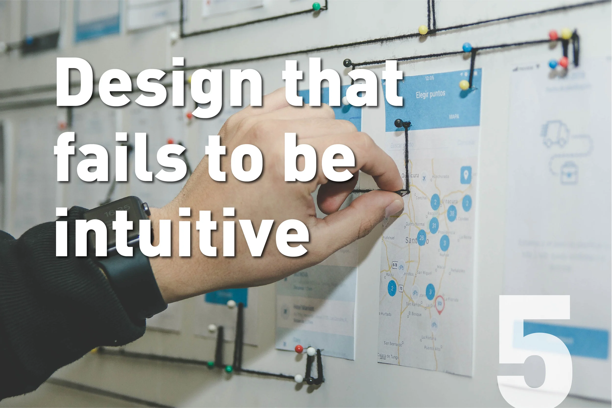
5. Design that fails to be intuitive
This is a big one.
It covers so many design disciplines in so many ways, and some of those ways can be nefarious in nature, which people use to stop consumers doing something they don’t want them to be doing.
Here are a few examples that bug me every day:
Packaging that is difficult to open. Don’t piss me off before I even use your product!
Doors that open by pushing that have a pull bar handle. I believe there is also a special place in hell for these doors, especially the one that have signs on saying push and pull. It should be obvious, and shouldn’t need signs!
Newsletter emails where the unsubscribe button is barely visible – who is this helping? Even if it’s to try to keep subscribers, that’s not a good idea. If someone wants to leave, let them leave, they’re clearly not interested in being a customer of yours any longer. There’s no value being given or received here.
We all experience these every day, and often you just brush it off as you being too fussy or not paying attention.
Don't take the blame for bad design!
In Donald A. Norman’s book, ‘The Design of Everyday Things’ (a must read for any designer), he discusses this idea of this kind of human errors split into two types: slips and mistakes.
Slips are subconscious – a mistake made along an experience.
Mistakes are conscious – these are made after thinking about what to do.
If you want to learn about more, buy the book here (affiliate link).
Or you can read this great summary on Medium by Lim Zhiyang here.
How do we avoid this?
Test and develop – with real people!
Nothing beats a thorough, iterative design process with plenty of user testing.
Always think about how people will interact with your design.
When you are in the deepest, darkest depths of development, it can be all too easy to forget about important details that make your design intuitive to use.
Image courtesy of @dylandgillis via Unsplash.
6. "You're just being negative"
This one really makes my blood boil.
Deep in the development process in the middle of a critique or feedback session, you start pointing out potential sticking points of the design, things that still need work.
Then someone says:
"Stop being negative".
Really?
Really??
There’s a fine line between being objective and being negative during the development process. But there is still a line.
It’s important to highlight the potential flaws of a design solution so that they can be corrected.
The difference between being negative and being objective - is the feedback or criticism constructive?
The faster you highlight potential issues, the quicker your development time will be.
It's literally that simple.
I believe the main difference between someone perceiving feedback about flaws or sticking points as negative or objective is the way in which you deliver them.
Your tone of voice matters a lot, and during any feedback or critique session, you should be conscious of your tone and the language you use.
Remember people perceive and hear things in different ways – language can be very subjective.
How do we avoid this?
Think about how you deliver your feedback before giving it.
Be firm and flexible, and try to open a discussion rather than simply throwing out harsh comments.
Back up everything you say with and objective reason. Ideally linking back to your research, discovery session and Personas you have created.
For example, instead of “It’s not right”, you could say "It's not right for this brand because it doesn't align with our customer personas".
For more on critique and feedback check out our article, The Power of Criticism – it’s full of handy tips to ensure this part of the design process goes smoothly and everyone leaves with a smile.
Remember, design is inherently a positive act.
You are creating a solution to someone's problem or improving an existing product.
No designer or client wants to make a bad product or solution – some comments may be ill- informed or incorrect – but remember that both parties want to make the best possible design they can.
We’re all in this together, after all.
Those are my top six designer cringe-points and how to avoid them!
I’m planning on turning this into an ongoing series of articles, becoming NSC’s very own agony aunt column.
So please leave your own cringe-points in the comments below, and we’ll see if we can come up with a solution for you.
Or share your stories of how you have overcome your personal cringe-points.
Reach out to us by using the #CreativeCringe on Instagram.
If you’re not a designer and still have a creative cringe-point, please get in touch, we'd love to hear them - maybe we can help.
You’re more than welcome to ask for advice in the comments below – we’re all about supporting the creative community here at NSC, and will do our best to answer any questions or give out advice.

