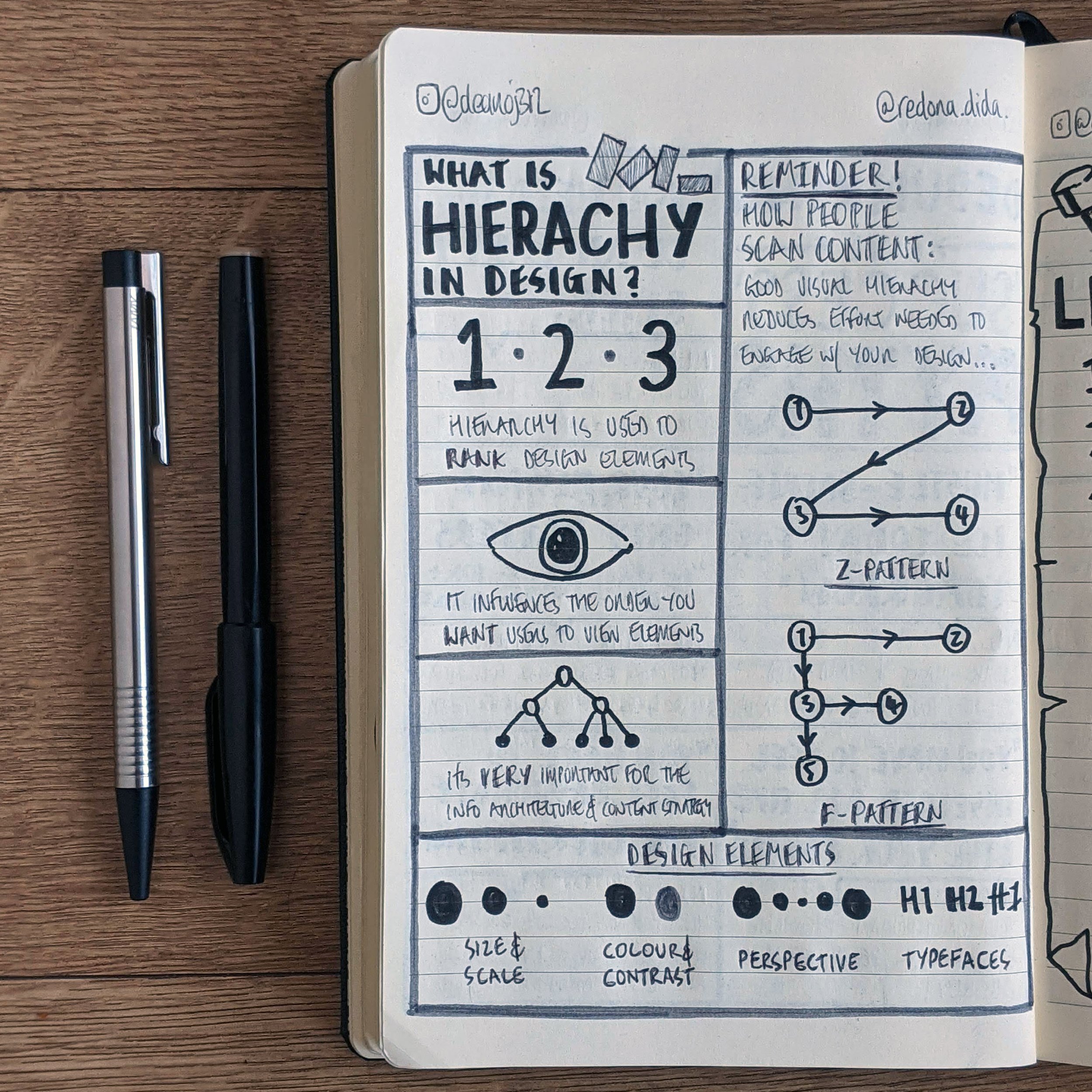
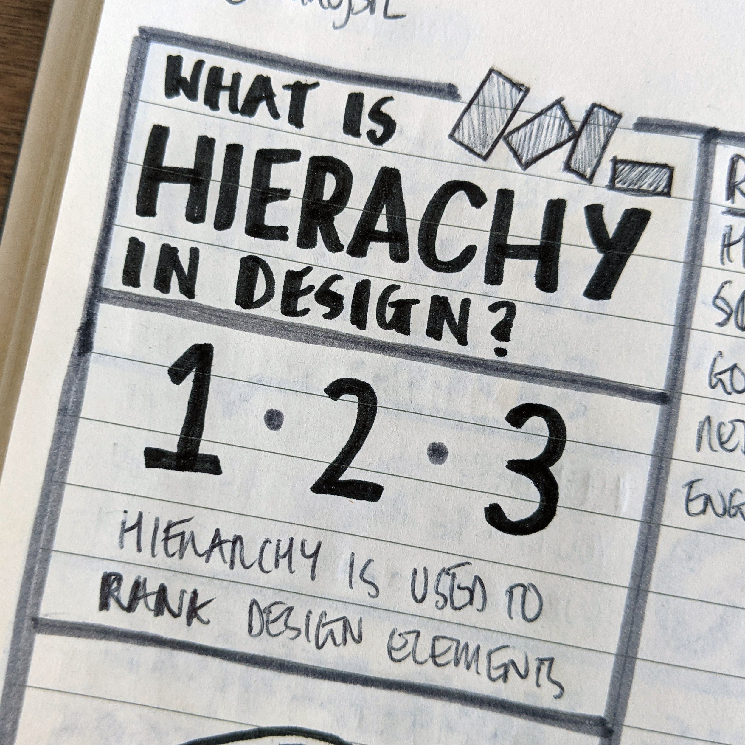
What is Hierarchy in Design
Inspired by an Instagram post created by @redona.dida.
It's too busy - where do I start?
How many times have you looked at a piece of design and thought this...
All the time - right!?
I know I do.
Good news - 90% of the time there is a simple solution, introduce a little hierarchy!
Shout out to Redona - for her super insightful IG post on 'What is Hierarchy in Design?'. If you're looking for a feed of tips and tricks to improve your designs, this is the feed for you!
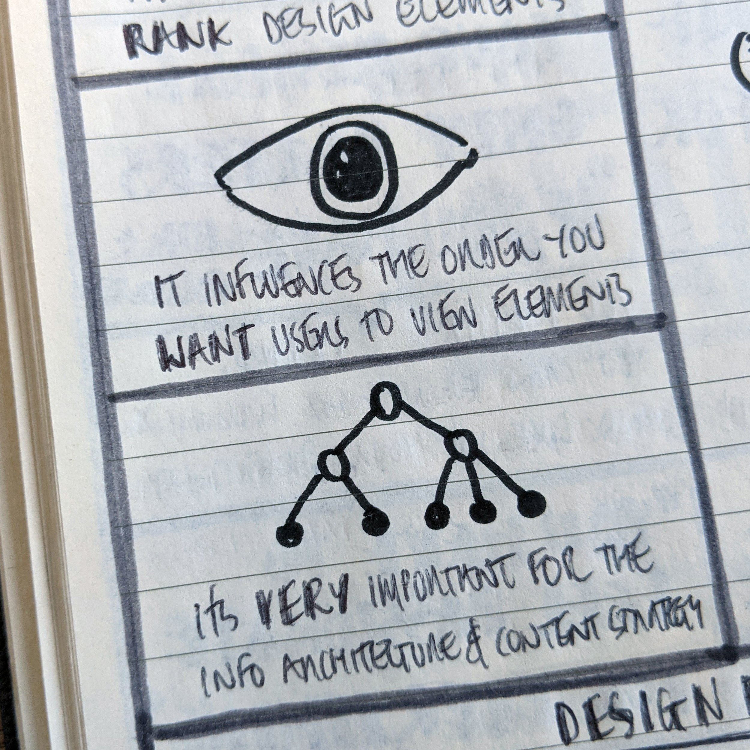
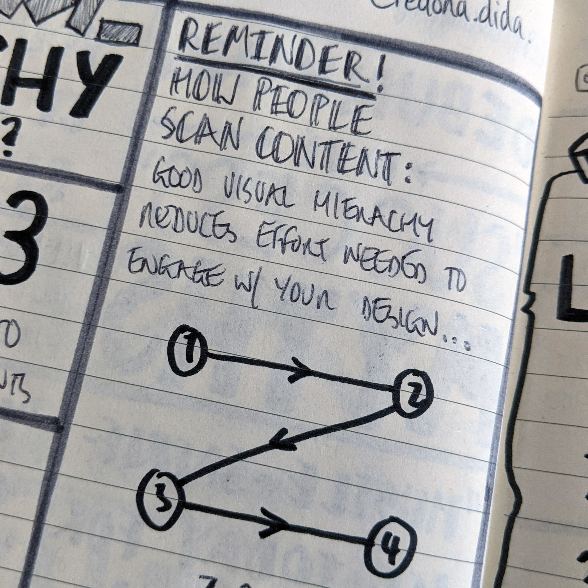
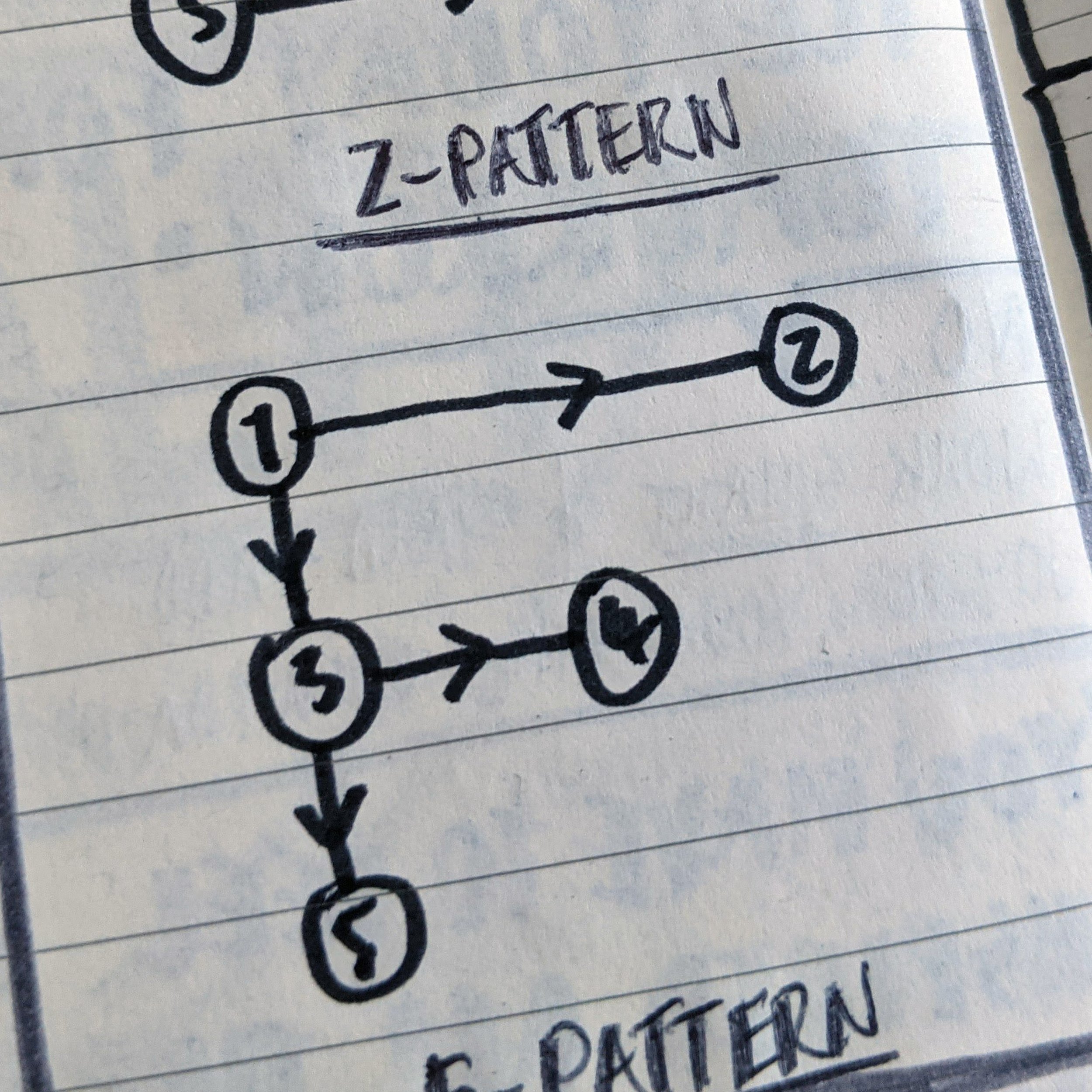
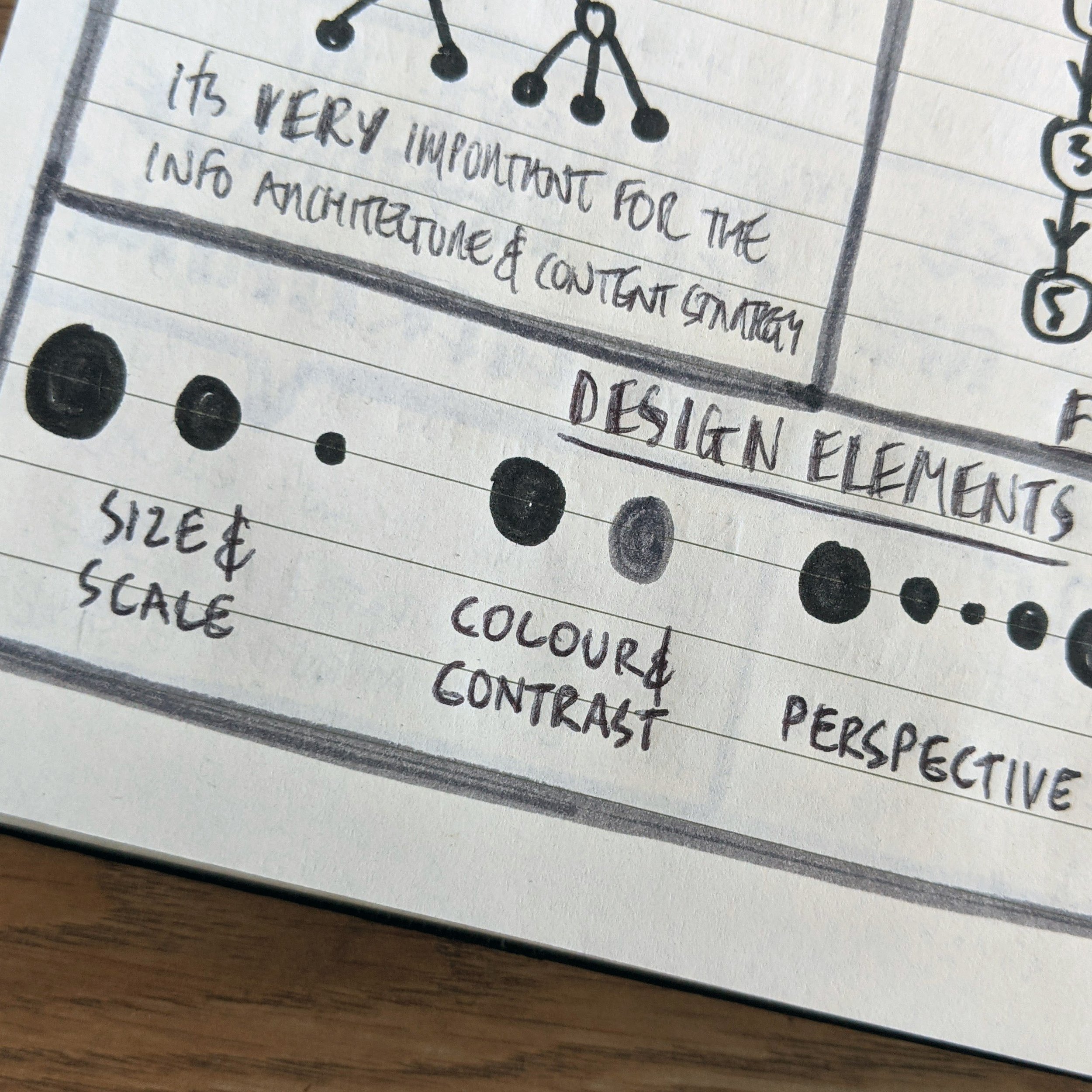
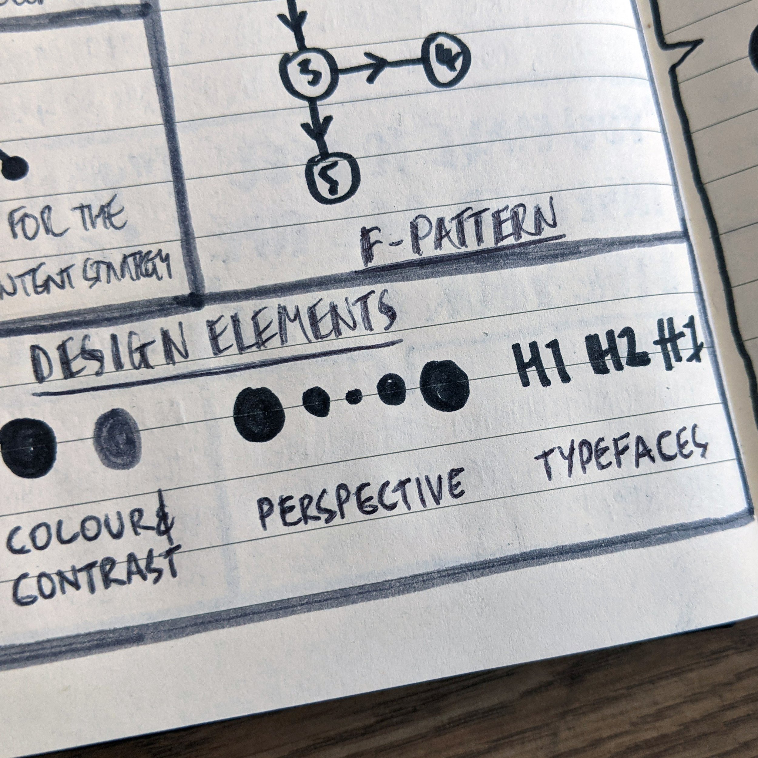
Hierarchy in design is super important it informs the user on how to process information in a design and in what order, this reduces confusion and overwhelming the user.
Remember, as a wise designer once said:
"Say it once, say it with power, say it in the least amount of words."
What's your top tip for creating good hierarchy in design?
Let me know in the comments below.
My top tip, is to gather a list of all the information needed to be included on your packaging, then rank them from most to least important.
Remember to balance the perspectives of the client and that of the user - often they don't fully align.
Interested in making your own IG to nudenotes transformation?
Check out my blog article about just that. A foolproof 4-step process.

