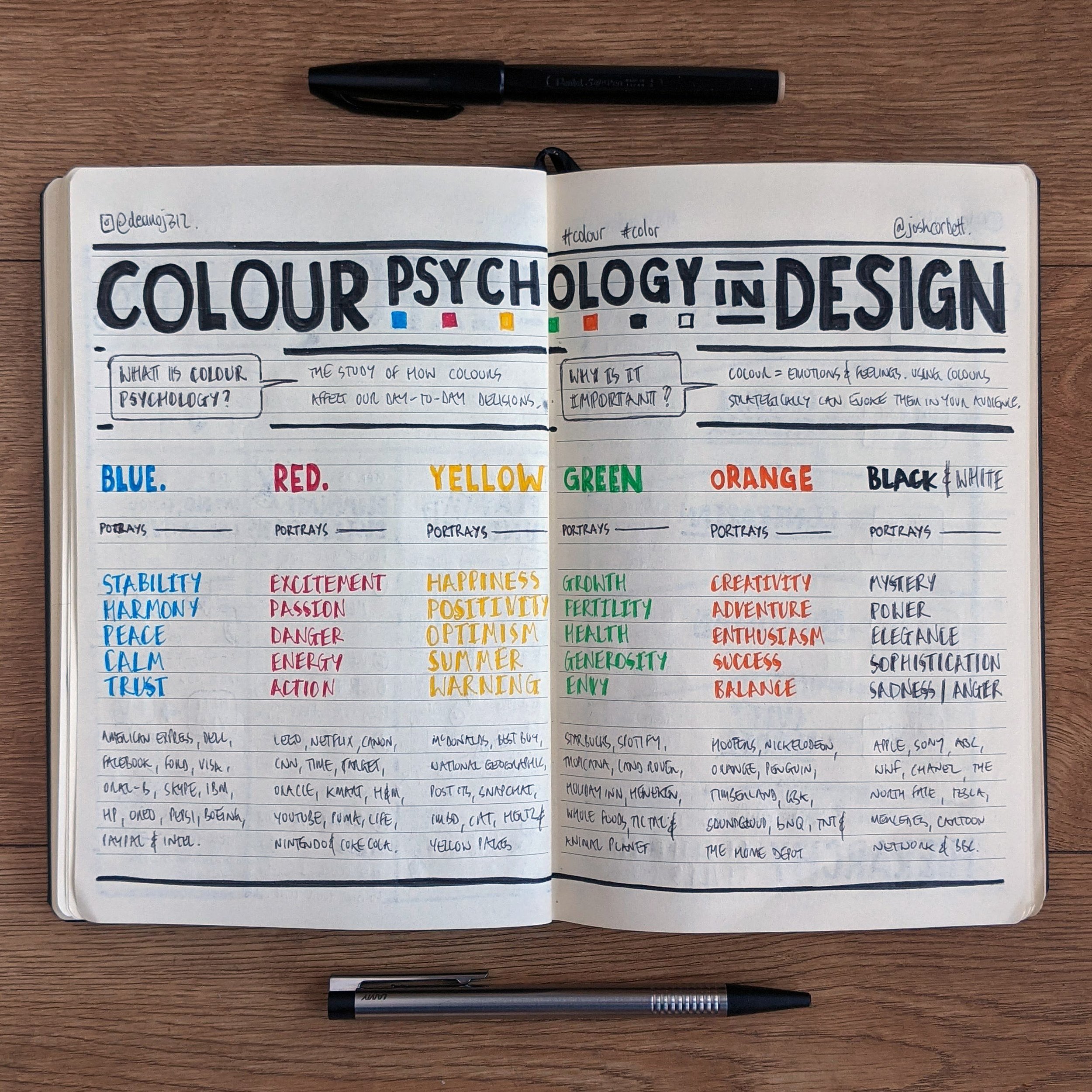
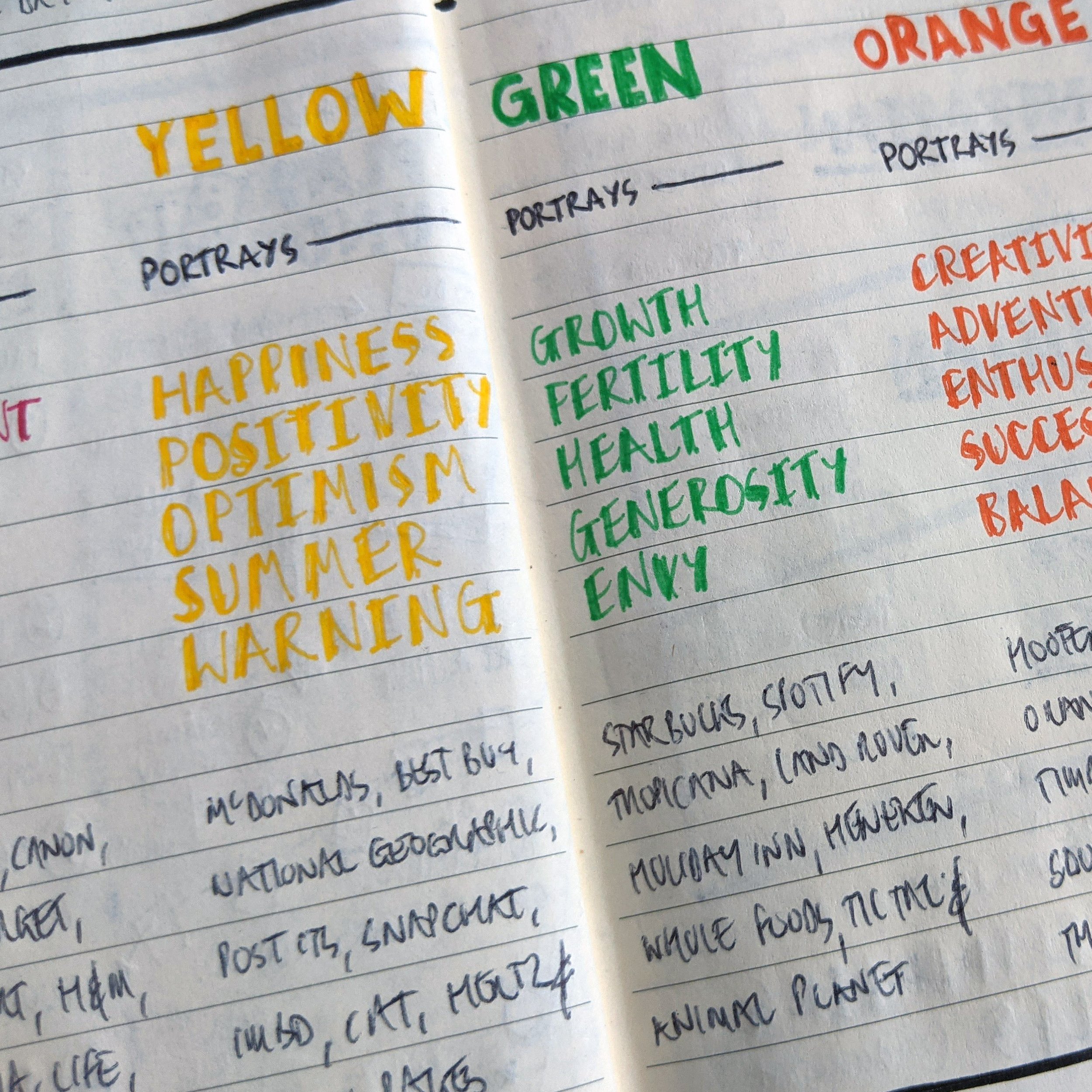
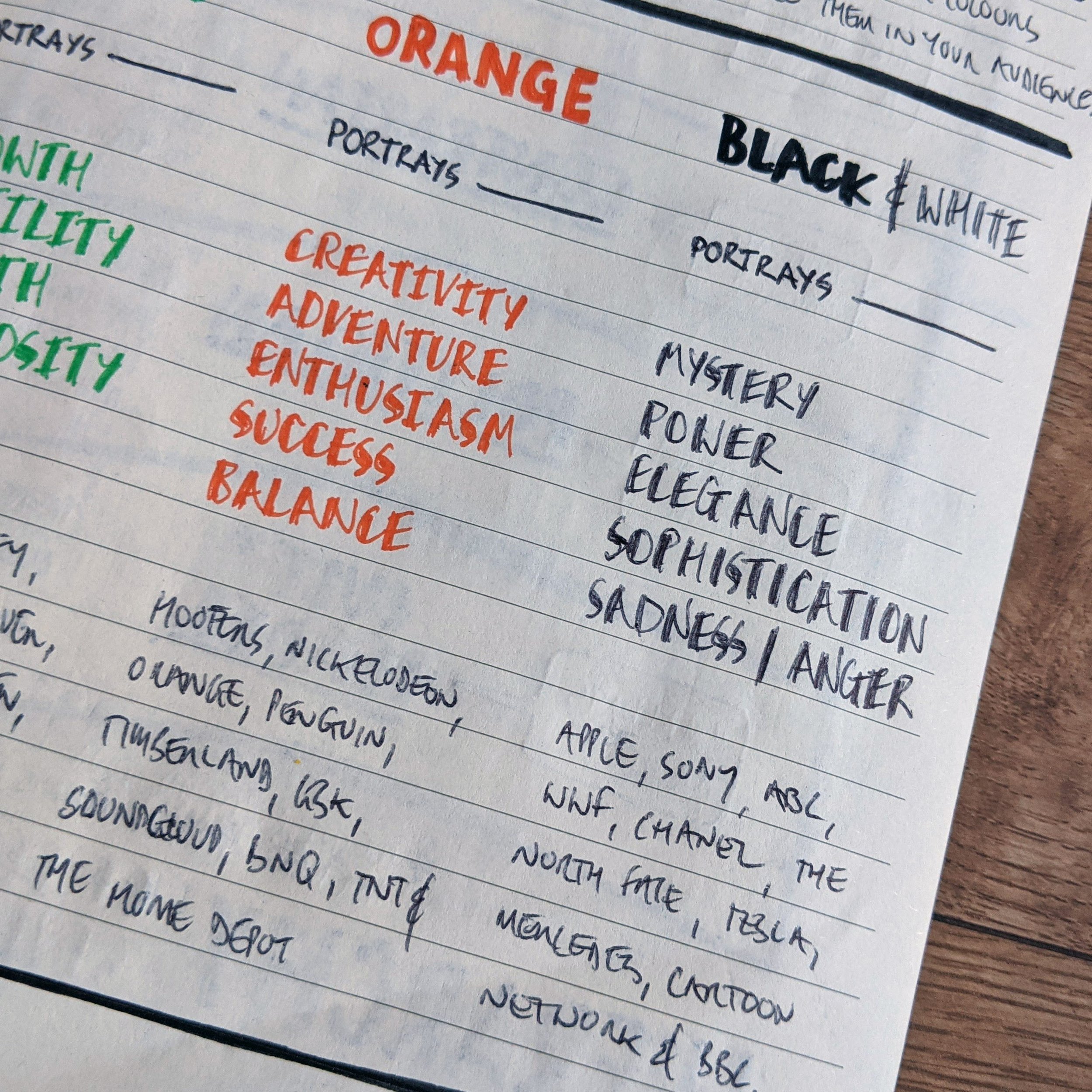
Colour Psychology in Design
Inspired by an Instagram post created by @joshwcorbett.
Think you know your colours?
But do you really - do you know the psychology behind them?
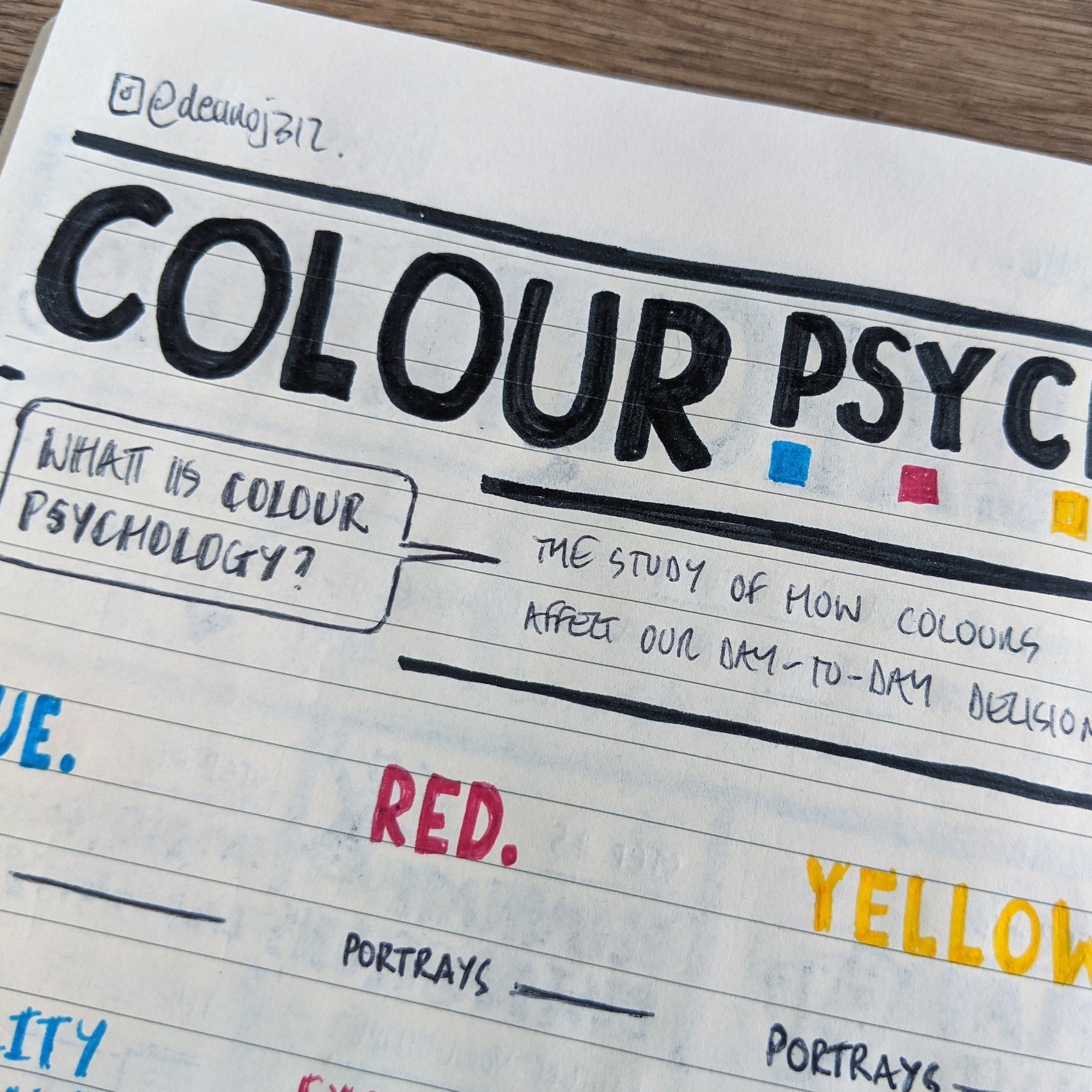
How colours affect our day-to-day decisions.
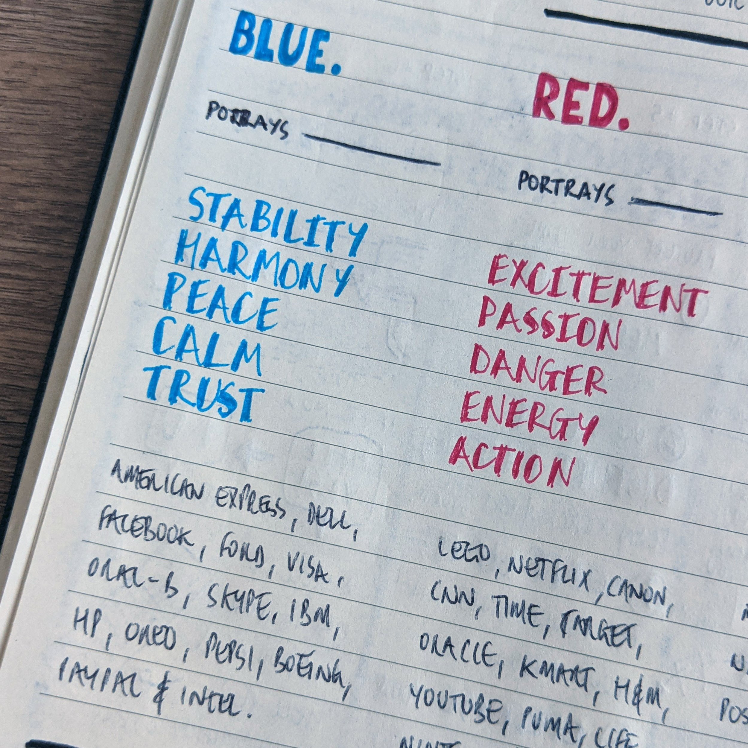
Ever wondered why Netflix's logo is red?
Or why most banks have blue branding?
In these nudenotes we're going to take a peak behind the rainbow.
What more tips and tricks on visual design and web development, Josh's feed is the one for you!
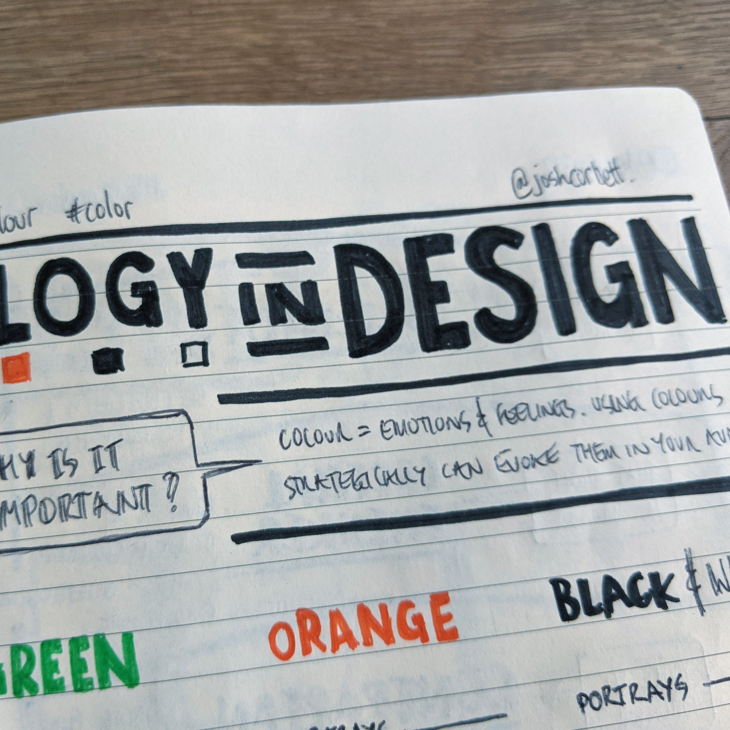
Colour are linked to our emotions and feelings, that is what makes them so powerful and important in design.
When used correctly, they can evoke and amplify feelings in your customers, even if they don't consciously know it.
The perfect colour choice can make or break your brand’s visual story. I hope this peek into colour psychology has opened your eyes, and prompts you to take a deeper dive.
Oh, this will be the first ever nudenotes post to use colour! 😬
In a small way, but it's still colour. Want to see more colour in my nudenotes?
Let me know in the comments below.
Interested in making your own IG to nudenotes transformation?
Check out my blog article about just that. A foolproof 4-step process.

